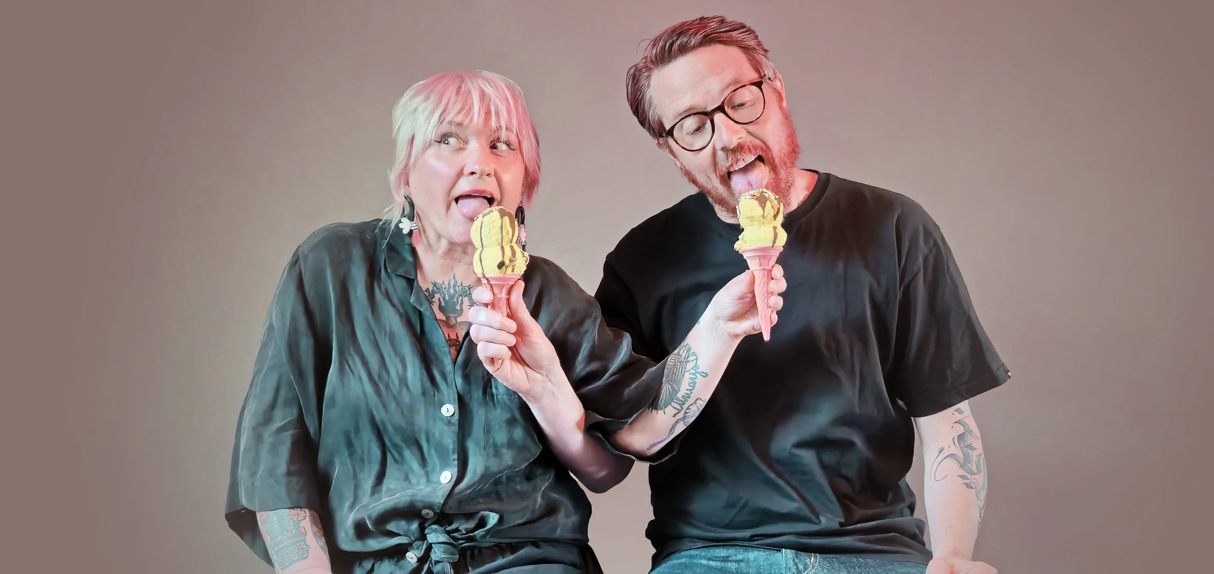
Ben O’Brien is one half of
EXTRA DOLLOP
We’re not an agency. We’re a creative partnership, hands-on, all-in, and working with clients we believe in. No bloated teams, no watered-down concepts. Just us, two senior creatives doing the thinking, designing and building, together.
You work directly with us, from idea to identity to everything that follows. We listen, we ask big questions, we make brave creative choices and we build the kind of brand people want to be around. We keep it clear, collaborative, and unpretentious.
We care deeply about a brand, the people behind it, and the ripple effect of doing it well. That’s what makes us the go-to for brands with bite.
If you want work that sticks, lands, and lasts — let's go.
What Can We Provide?
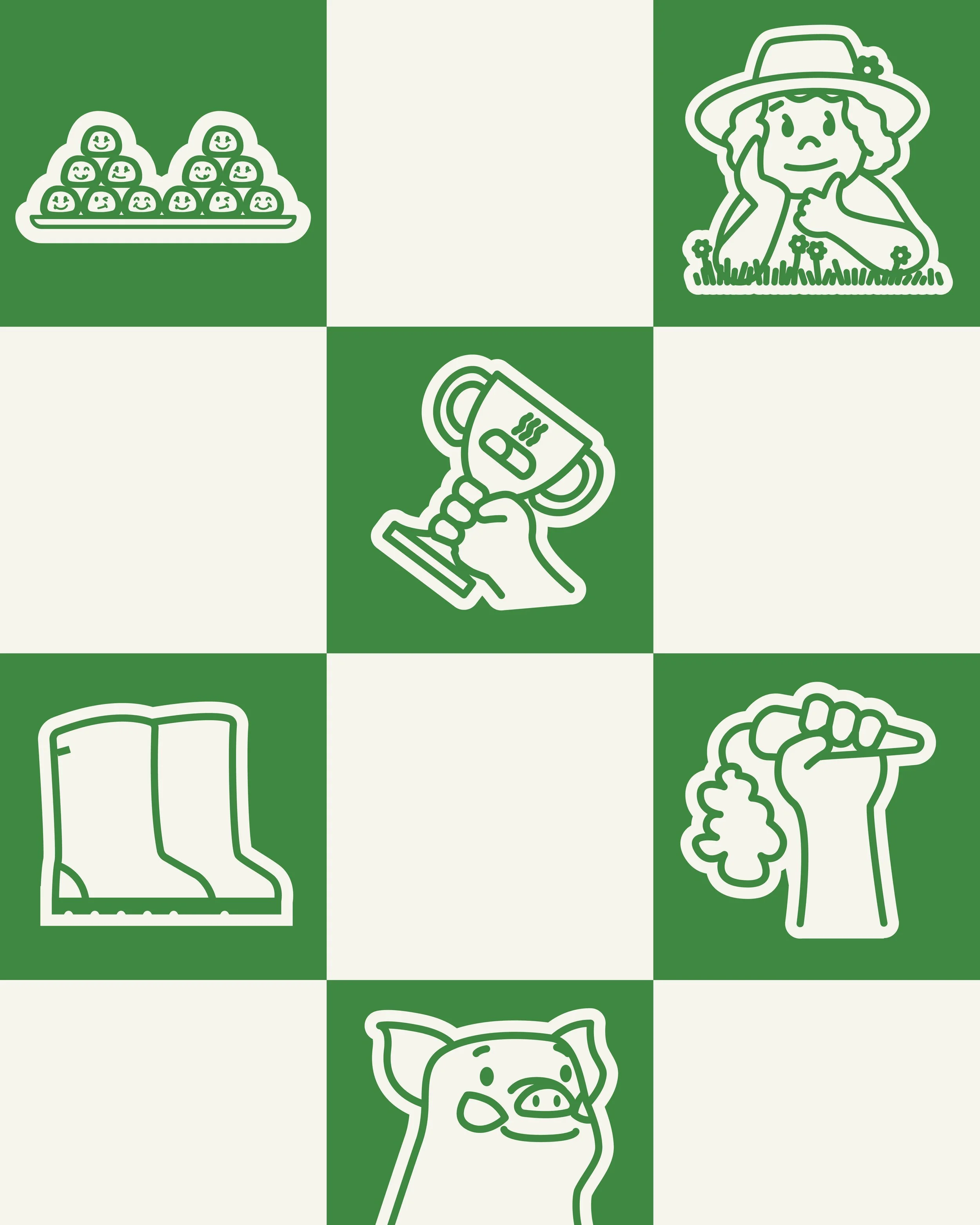
Brand Design :
Brand audits, trend research + moodboarding
Naming + brand concept building
Storytelling + tone of voice
Logo design + visual identity systems
Icons, colour palettes + design guides
Website Design :
Squarespace website design + build
Shopify online store design + build
Website copywriting
Icon design + illustrations for web + socials
Motion design + animation
Print Design :
Custom illustration + artwork
Packaging layout design
Merchandise concept + design
Advertising design
And Who To?
Indie food + drink brands
Creative venues + cultural projects
Weird shops + product makers
Small businesses with big messages
Who Are We?
We’re Fi and Ben O’Brien, a brand studio duo building brands that stand up and stand out, bland is not an option. We’ve crafted cult favourite brands, launched new ventures, and put underdog brands into the spotlight across food, drink, culture, design, and independent retail.
Fi brings the strategy, voice and direction, the Special Sauce that gets to the heart of who you are and how you sound. Ben’s the visual world-builder, turning stories into bold, joyful design that people actually remember.
Together, we’re Extra Dollop. Because whatever we’re working on, we bring more to the table; care, creativity, cultural relevance and flavour.
We’ve spent decades (yep, decades) in the game, working across branding, storytelling, illustration and creative direction. We’ve seen trends come and go. What sticks? Brands with authenticity. Brands that feel alive. We don’t do fluff.. We do the work that makes people look twice, take notice, and come back for seconds.
Launching something new? Shaking off an old look? We’ll help you find your edge — and turn it into a cult-classic best seller.
CASE STUDIES
〰️
CASE STUDIES 〰️
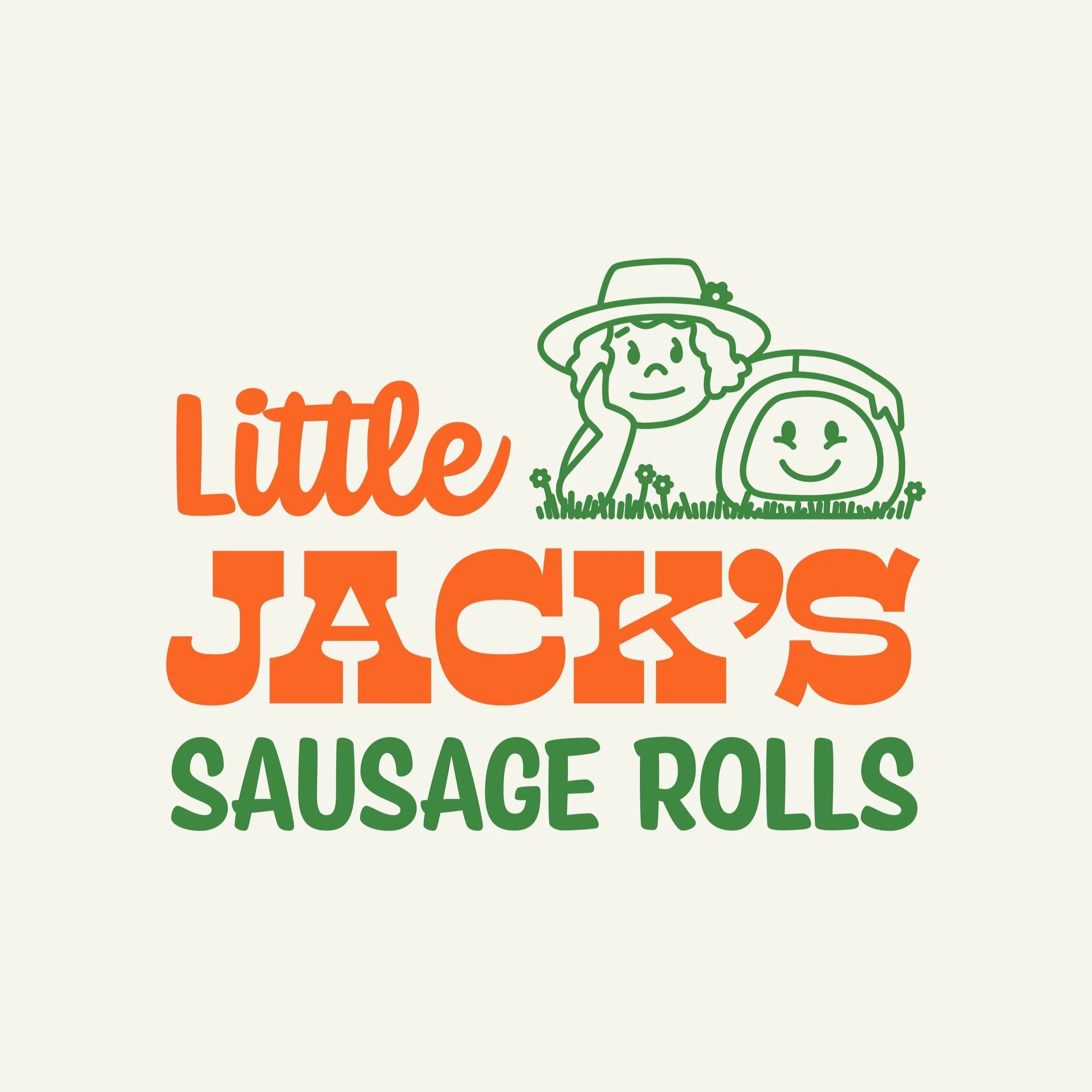
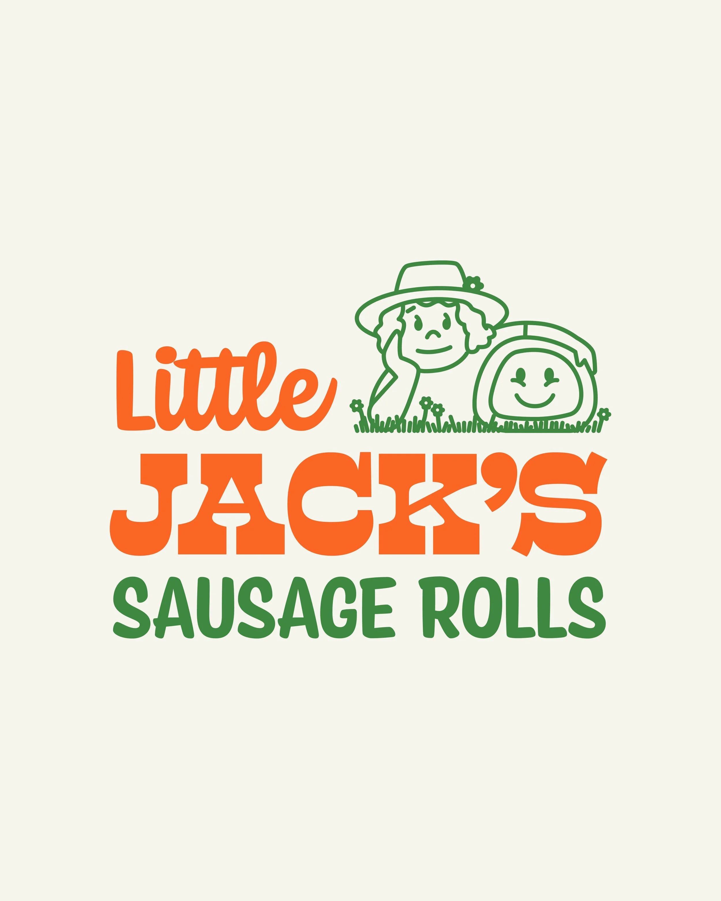
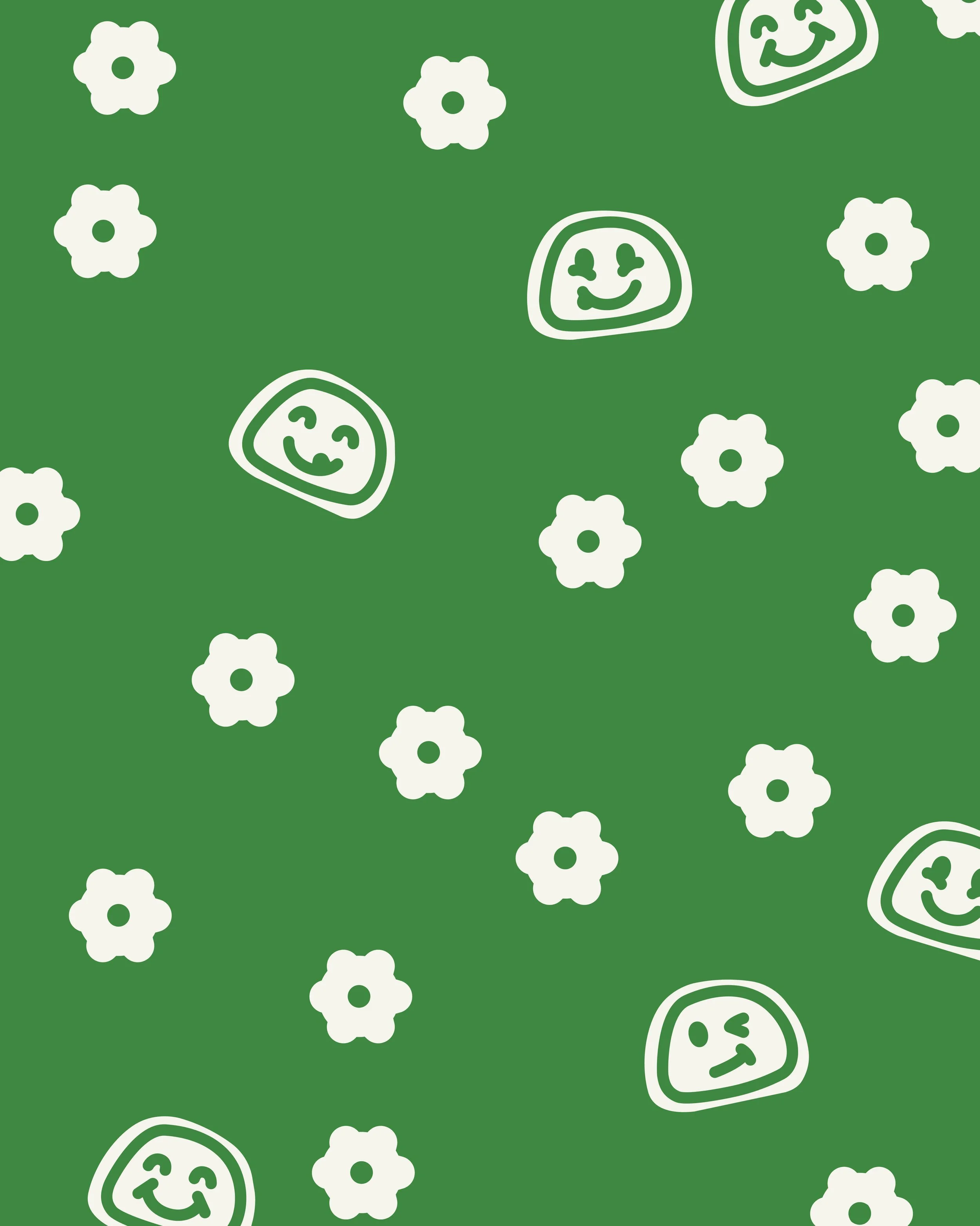
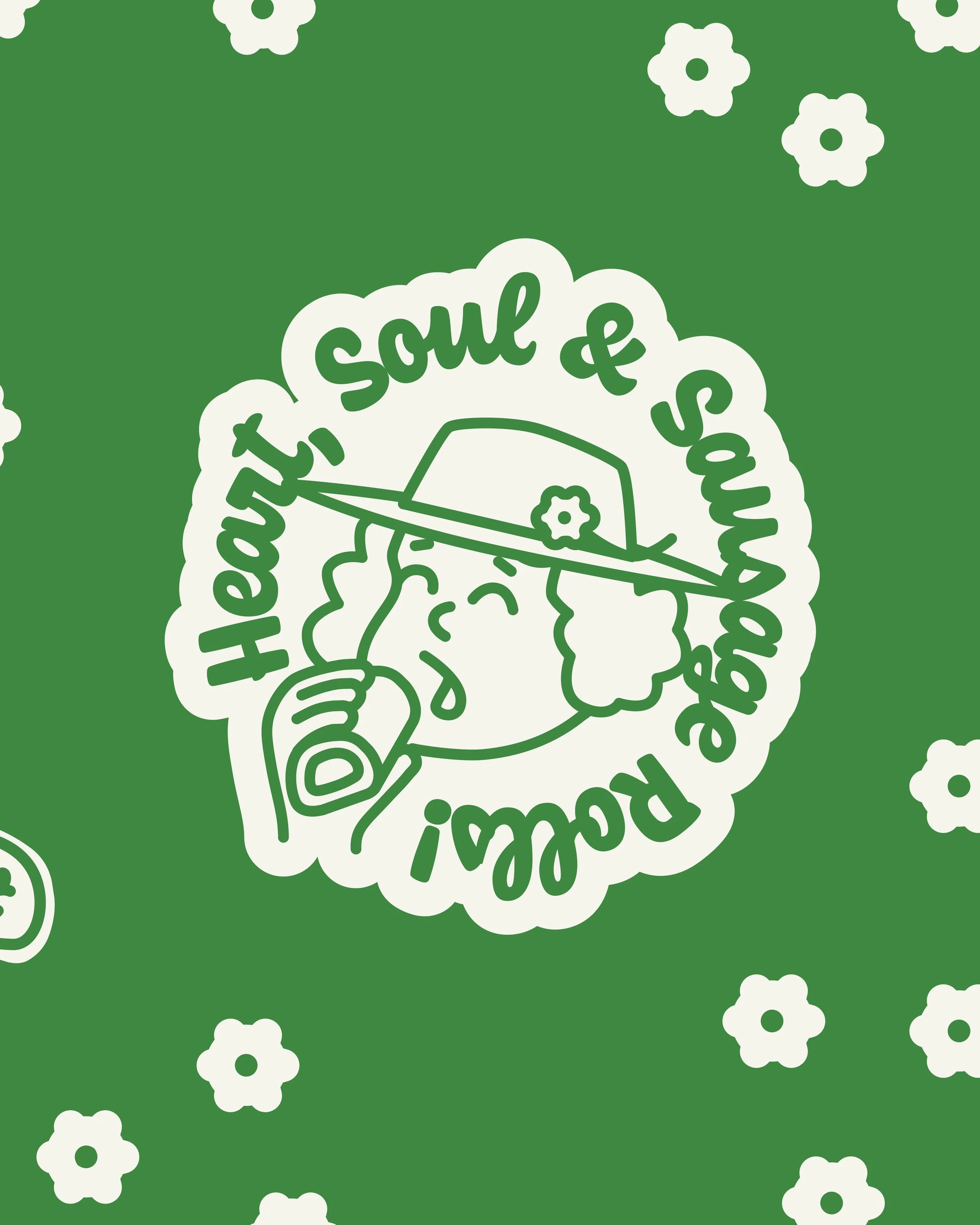
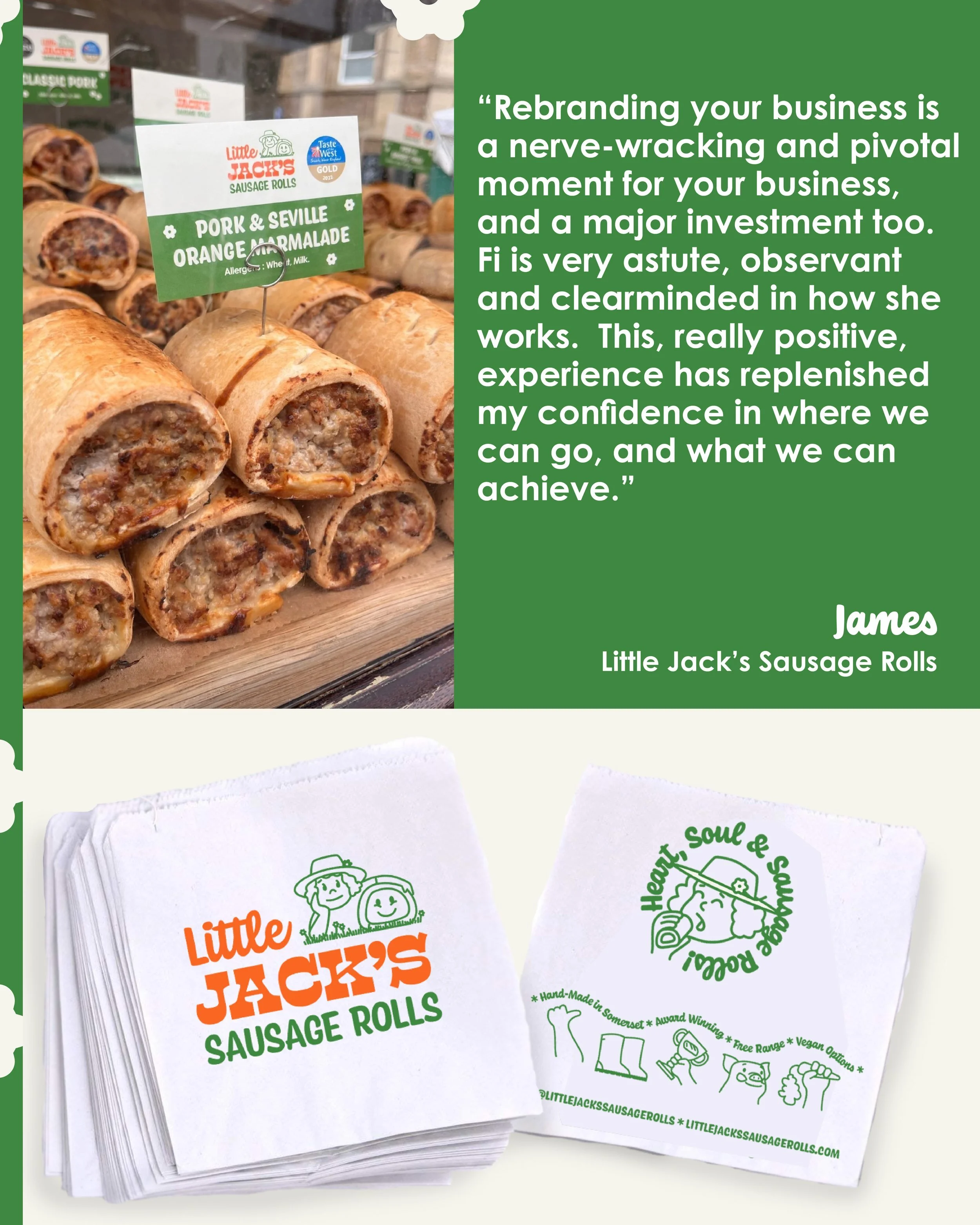
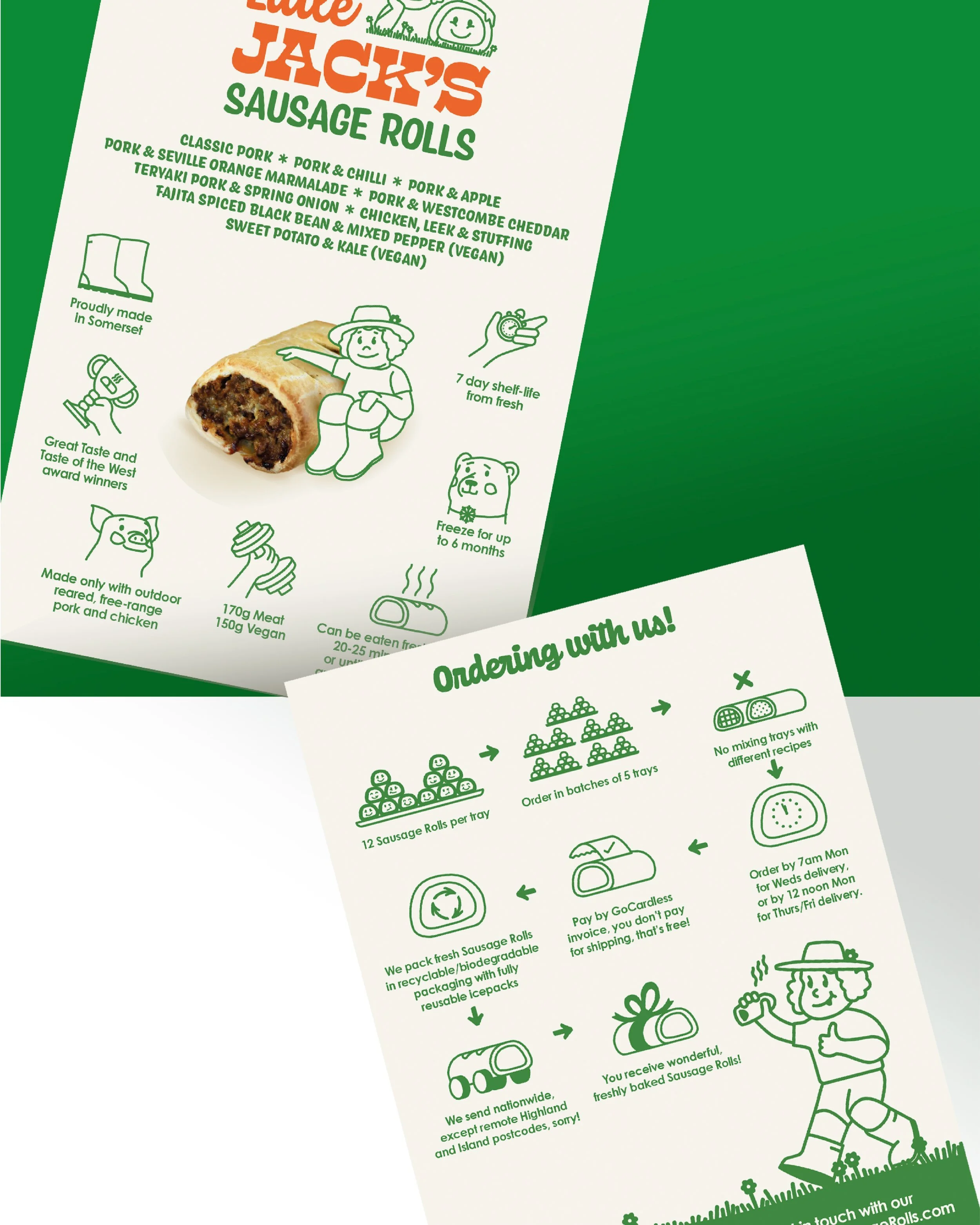
Little Jack’s
A fresh identity for a wholesale sausage roll brand with big heart
(and serious flavour).
Little Jack’s came to us ready for a new chapter, a shift from local favourite to a brand with real regional impact.
We partnered with the team to reshape the brand strategy, refresh the name, craft a new tone of voice, and build a full identity system that captured their heart, humour, and Somerset roots.
From brand storytelling and messaging to website design and social media launch strategy, we helped Little Jack’s show up bigger, bolder, and more true to themselves; with a brand that finally matched the quality of what they were baking.
More heart. More hustle. More sausage roll glory served fresh, with an Extra Dollop on top.


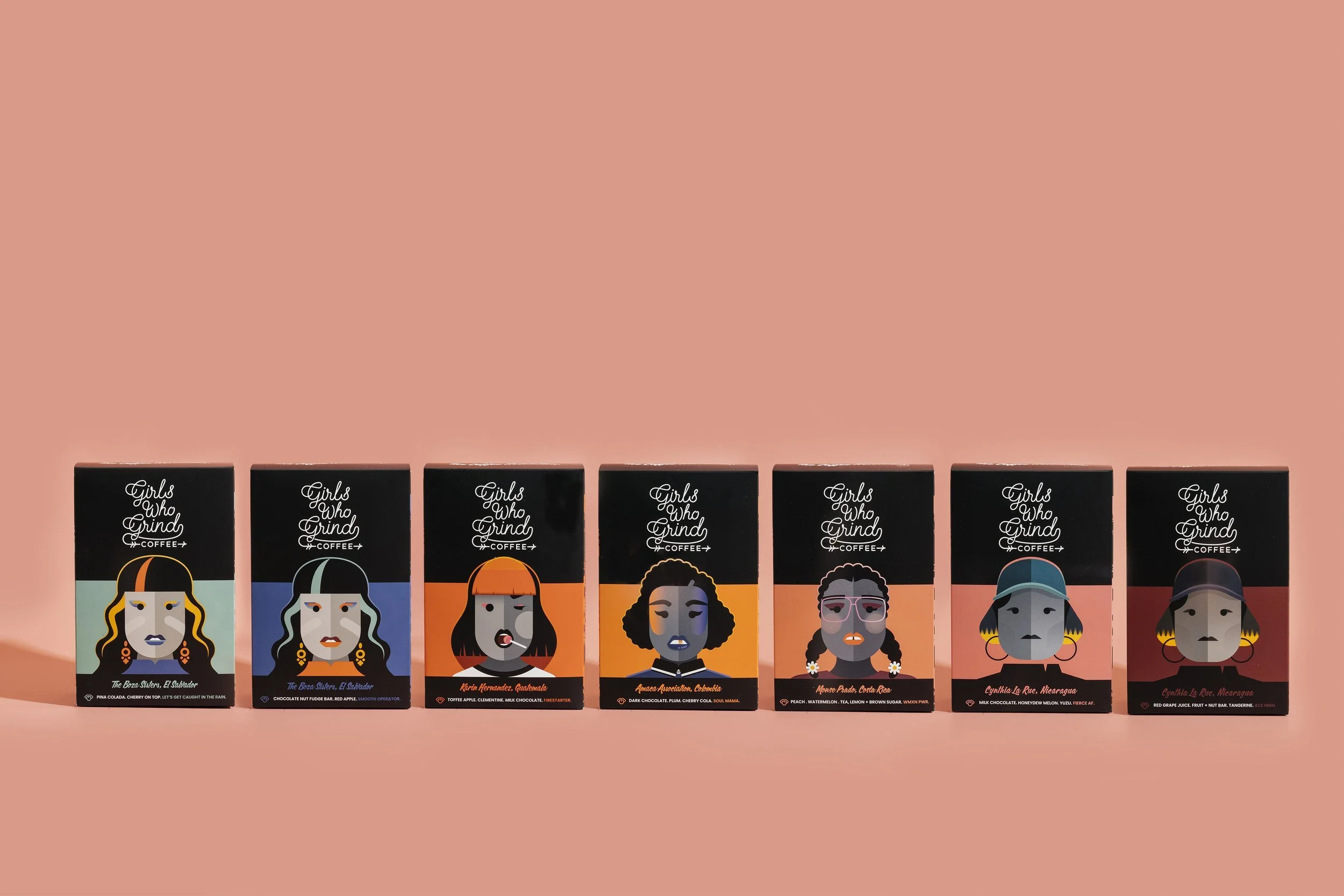
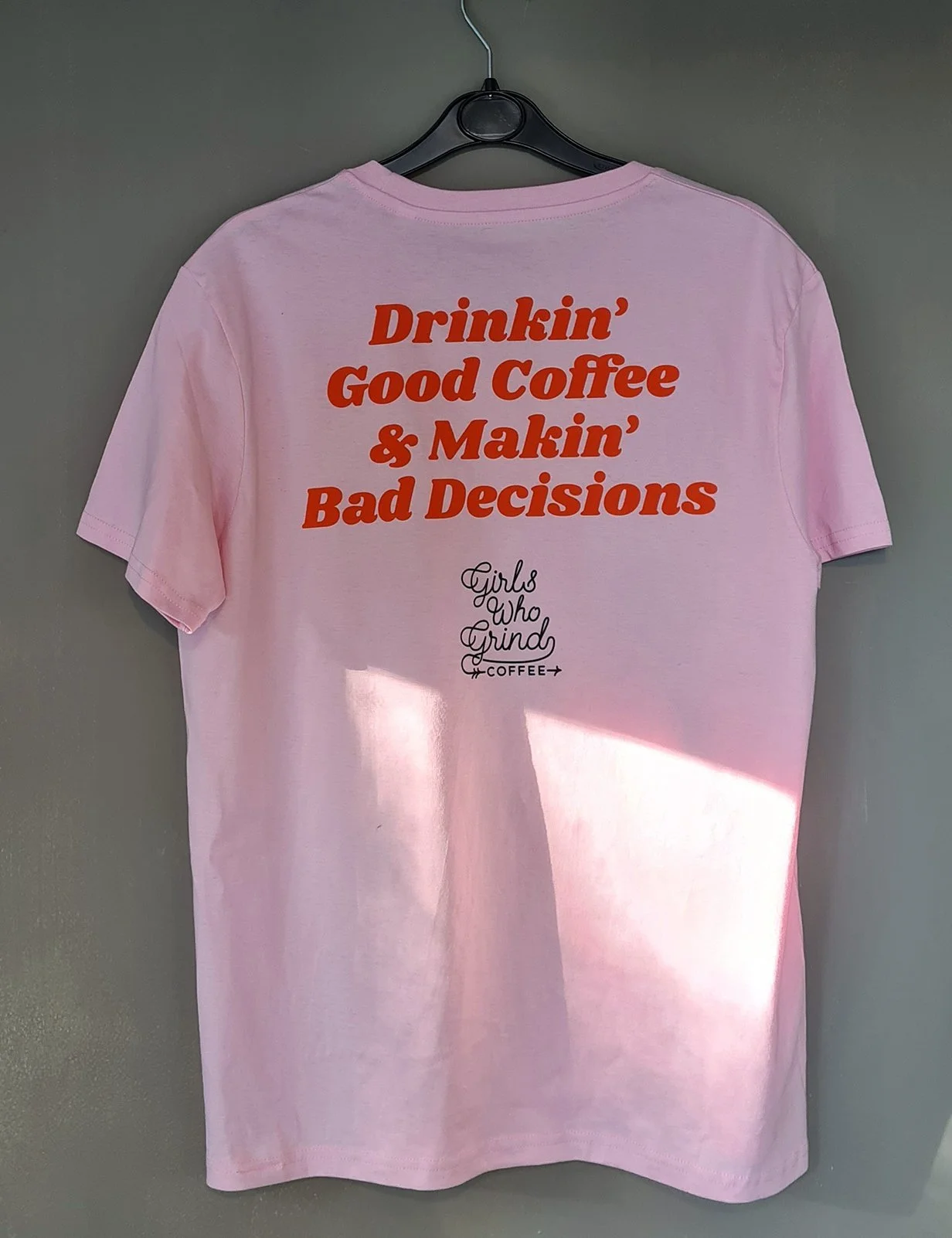
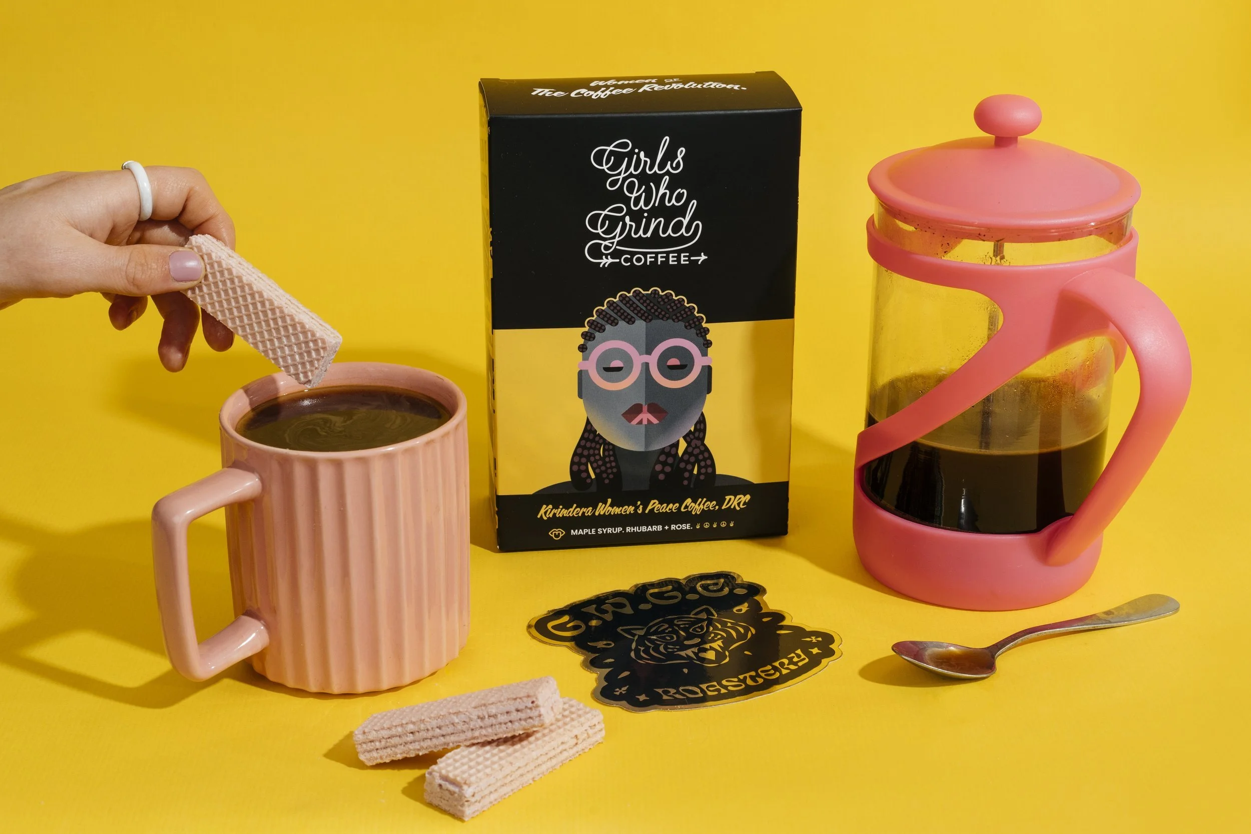
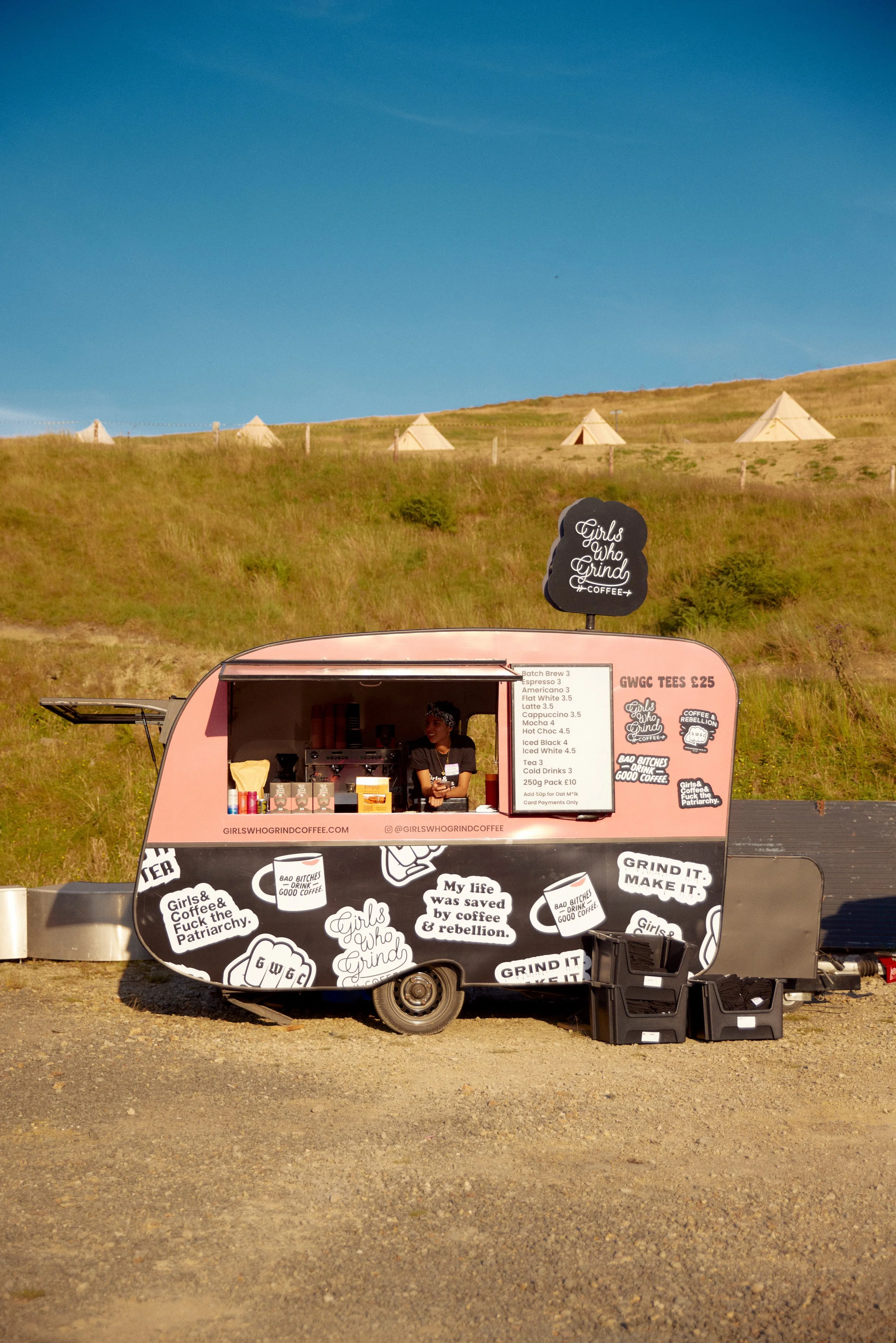
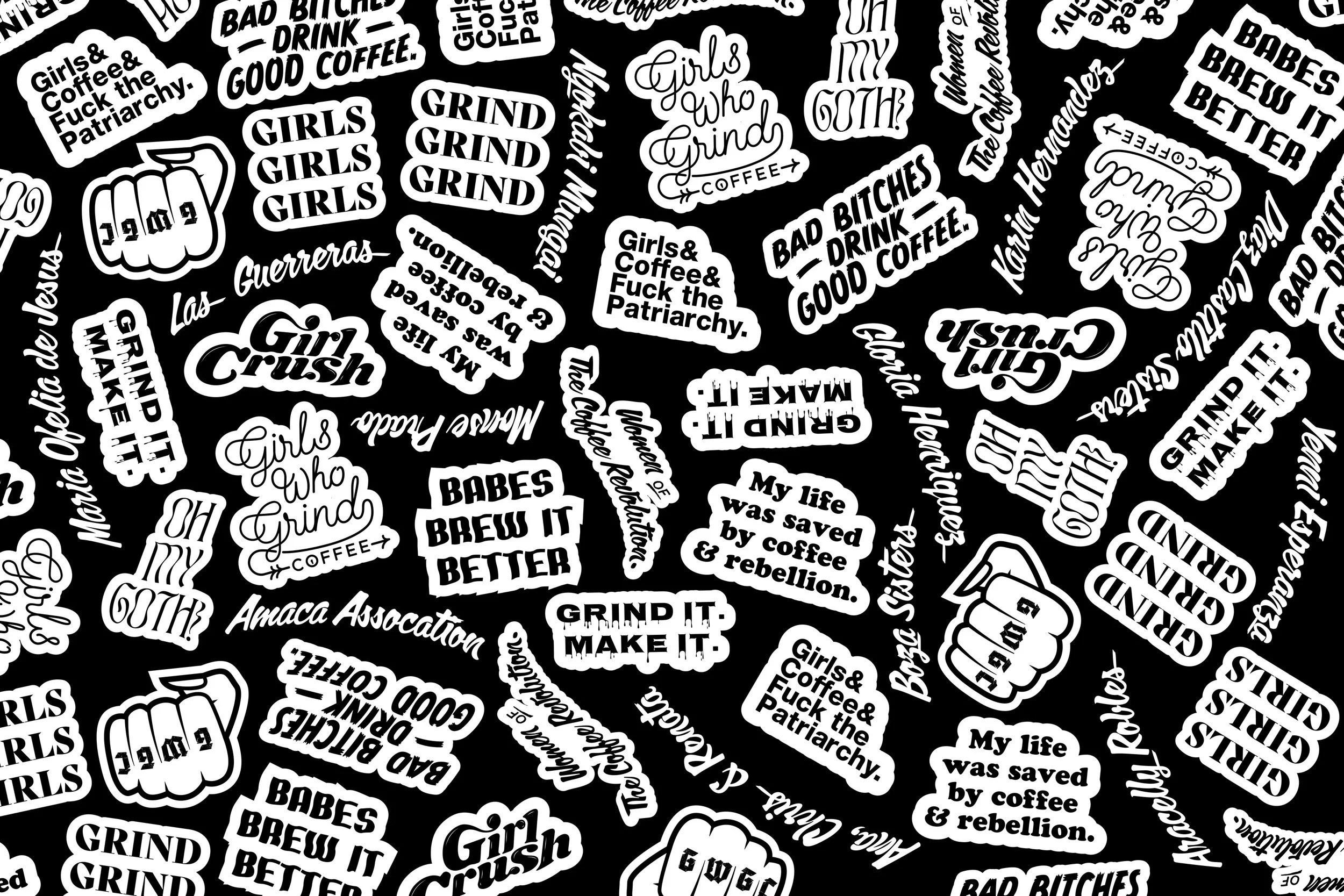
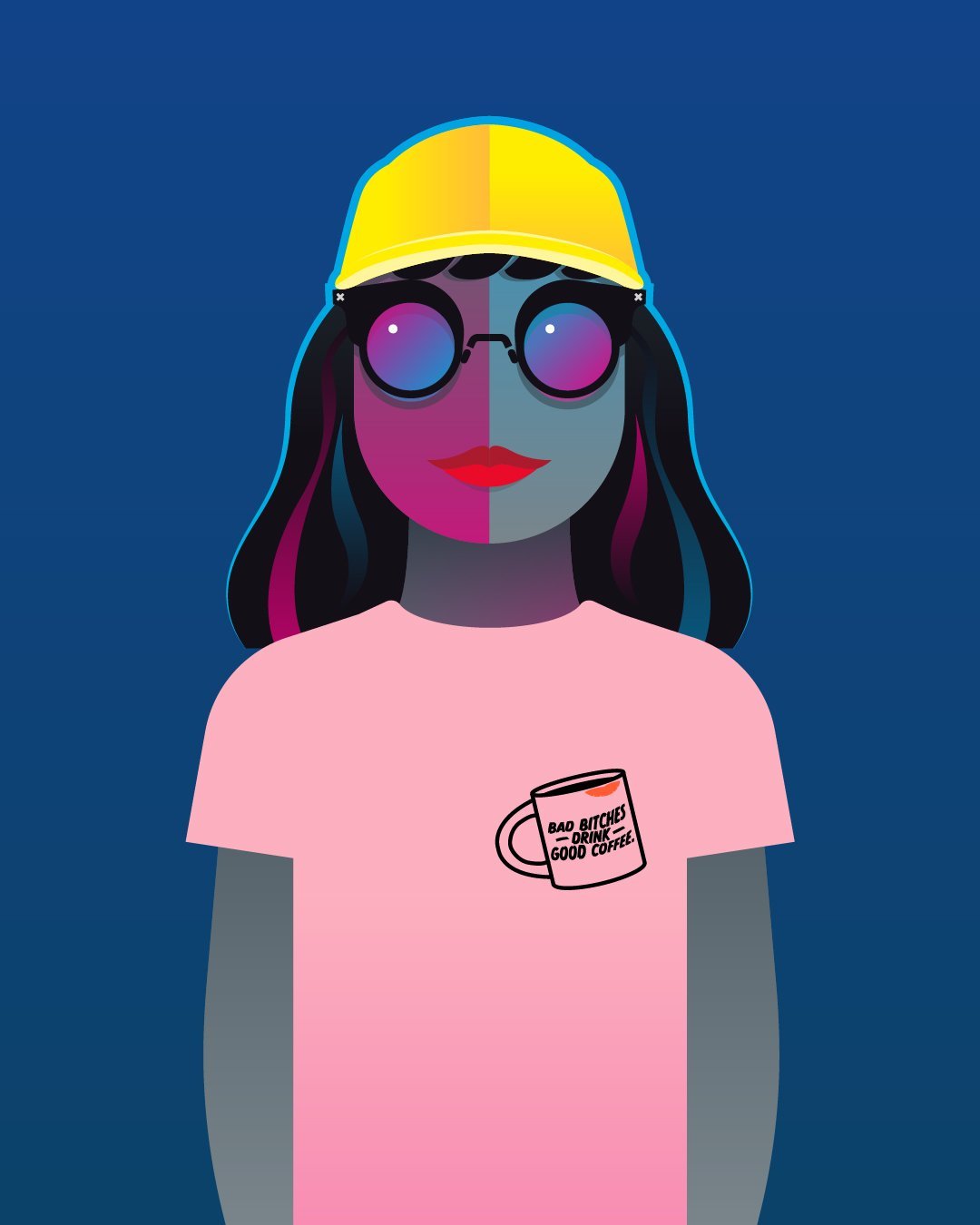
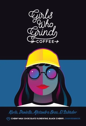
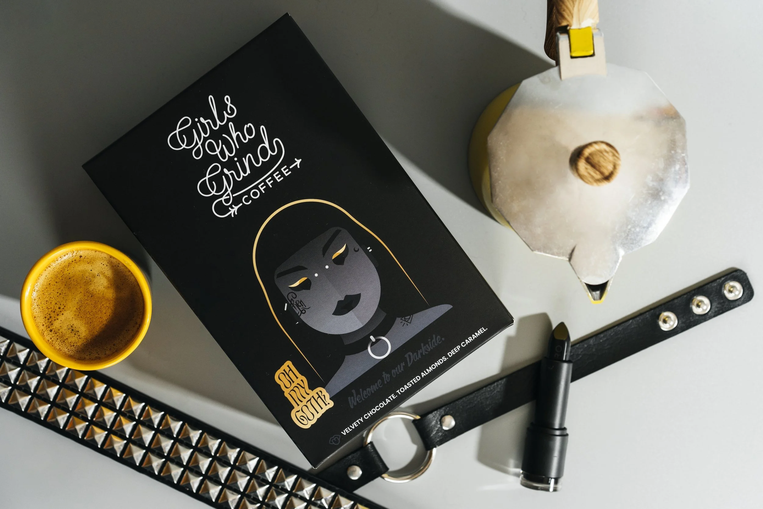
Girls Who Grind Coffee
The cult disruptor brand that brewed a global movement.
As co-founder and Head of Brand at Girls Who Grind Coffee, Fi built a female-led specialty coffee company celebrating women in the industry from the ground up. She created the name, developed the voice - playful, rebellious, and unapologetically risqué and shaped a brand world that stood out in a traditionally male-dominated space. Ben designed the full visual identity: from logo and illustration style to packaging, merch, and the creative assets that made Girls Who Grind impossible to ignore.
Together, we built a brand that turned customers into a global community, fuelled by good coffee, great stories, and a shared spirit of defiance. Fi also launched Coffee + Rebellion - connecting skaters, surfers, bikers, writers and other barrier-breakers rewriting the rules in their own worlds.
We’re proud to have created the original identity and energy behind Girls Who Grind Coffee. Since stepping away, the company has moved in a new direction, but that spark still lives on.


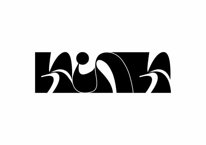
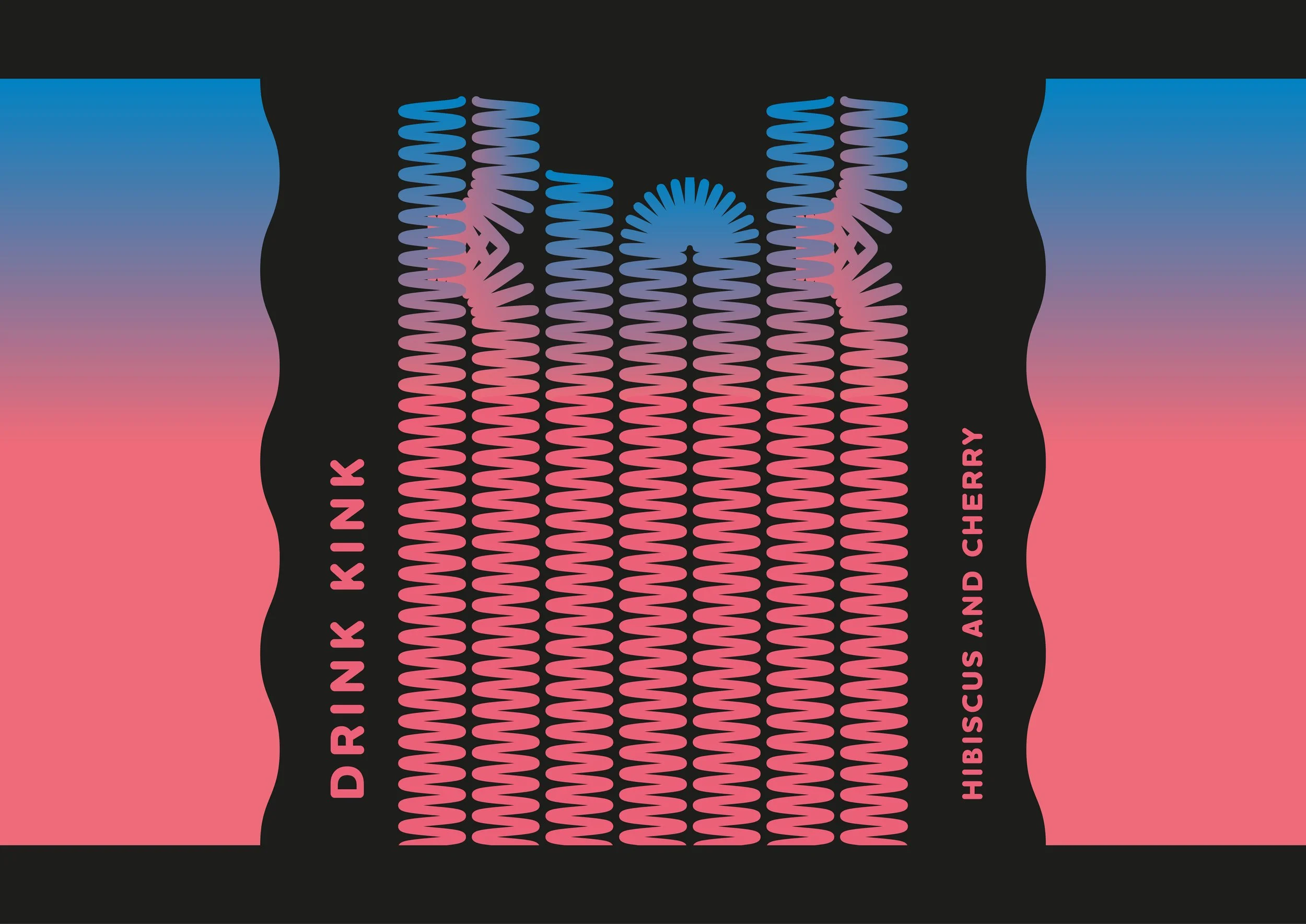
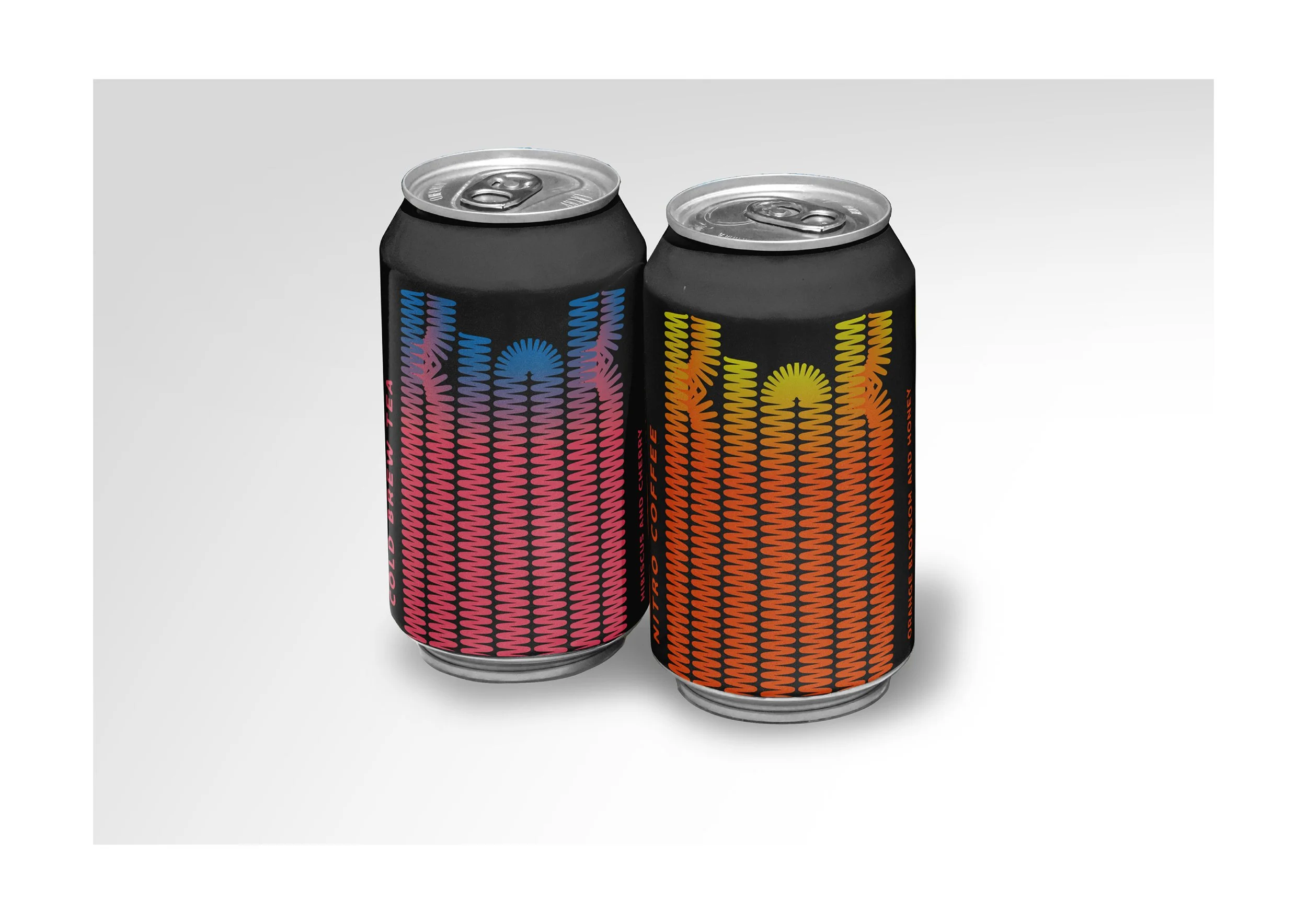
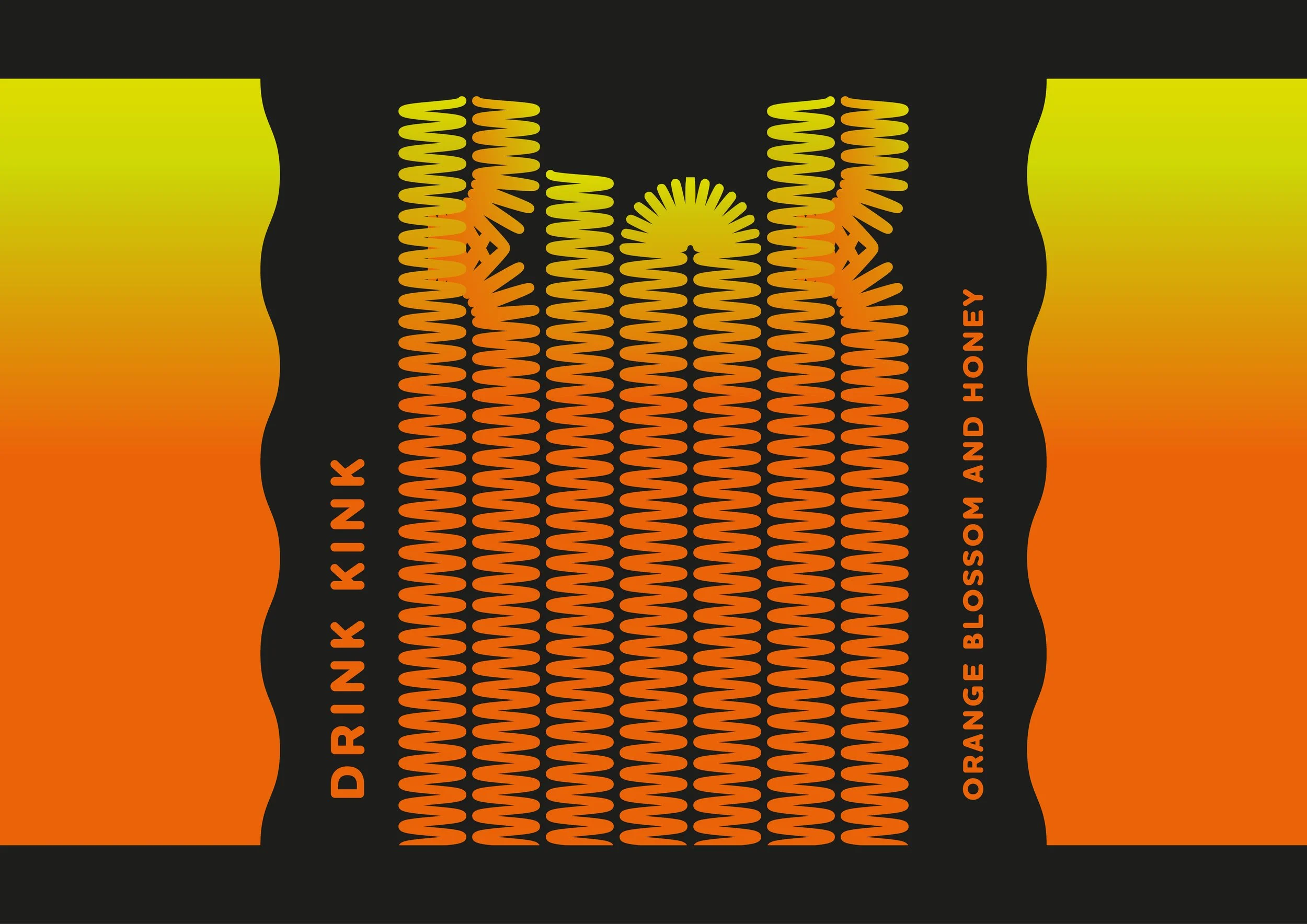
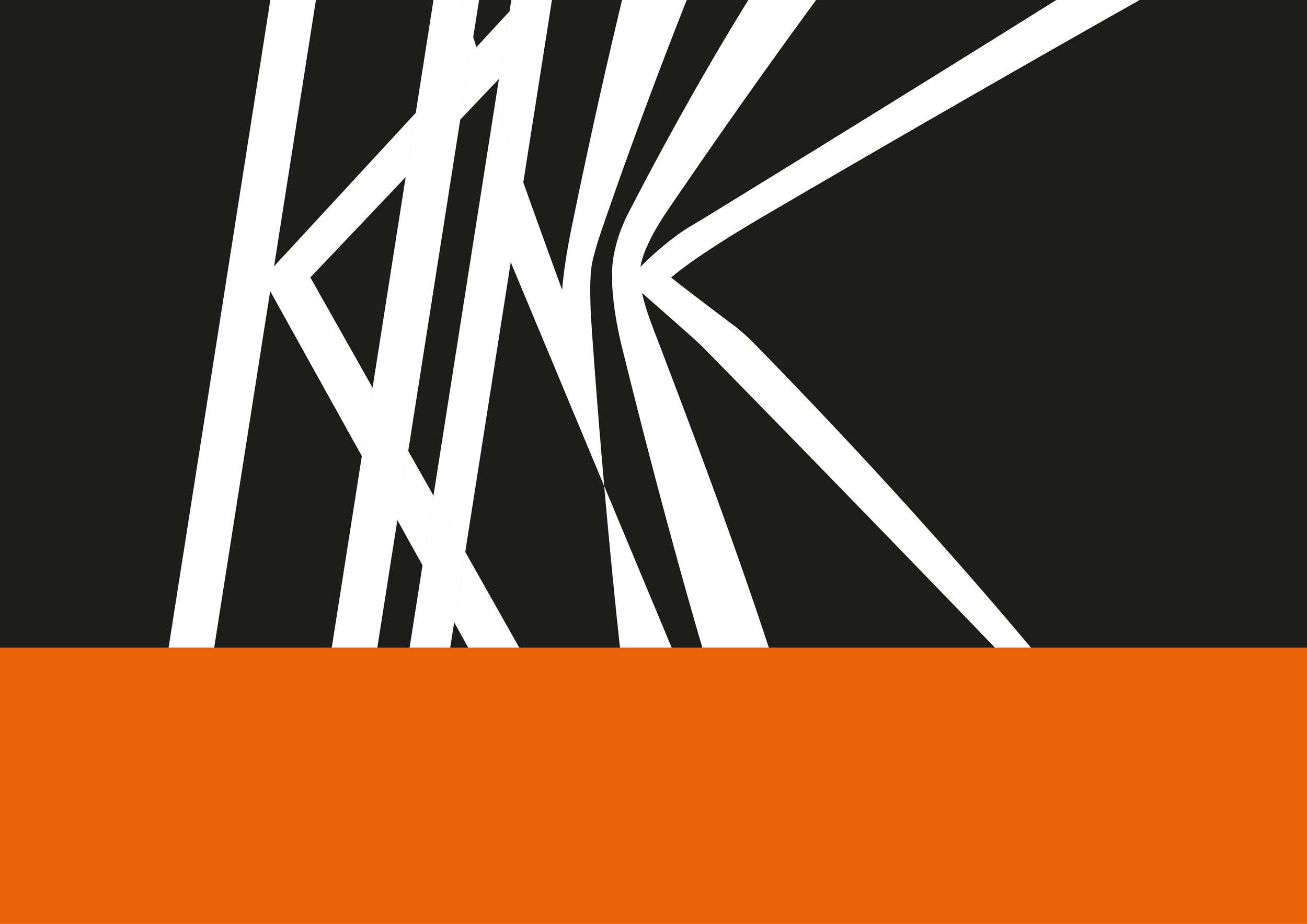
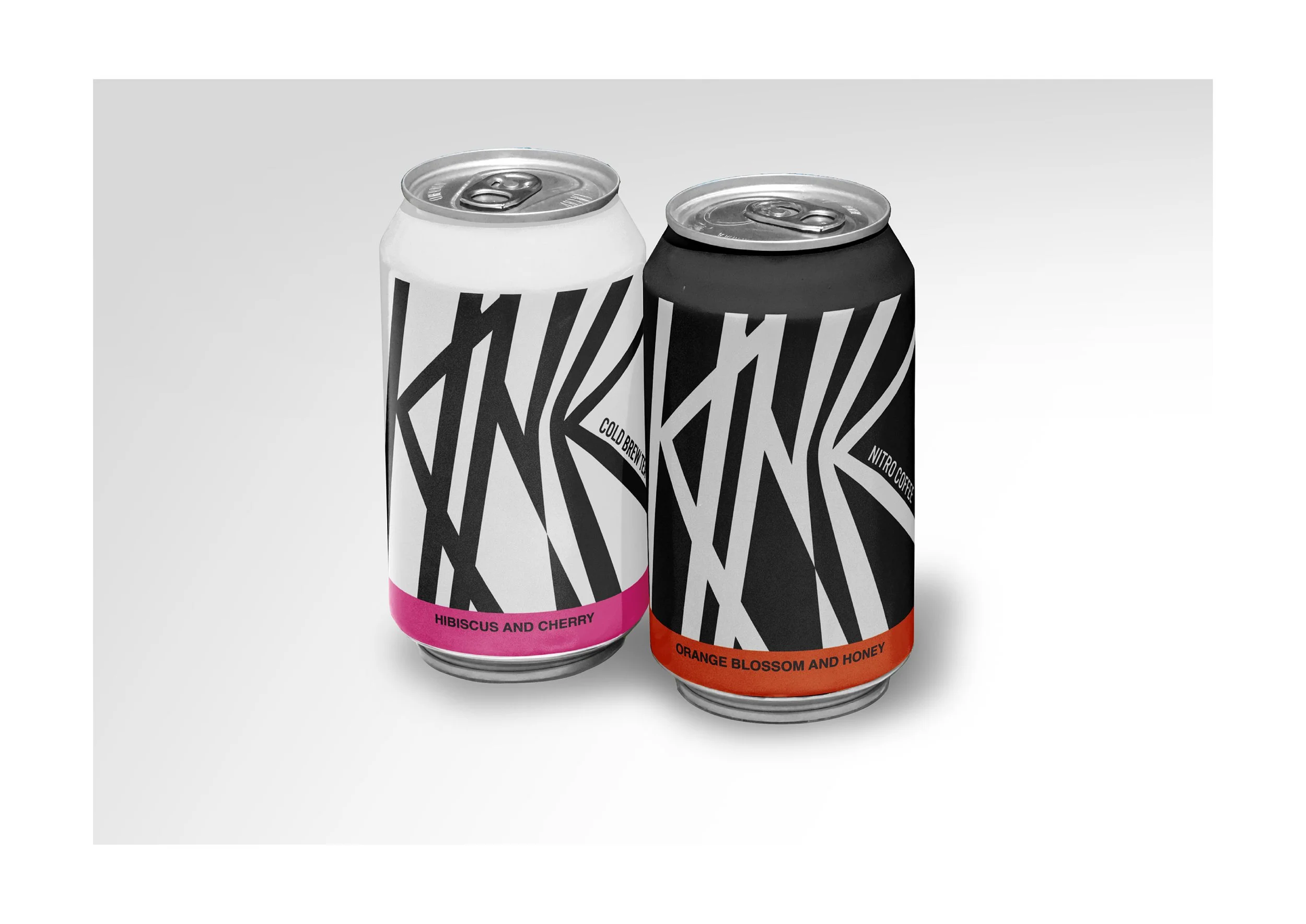
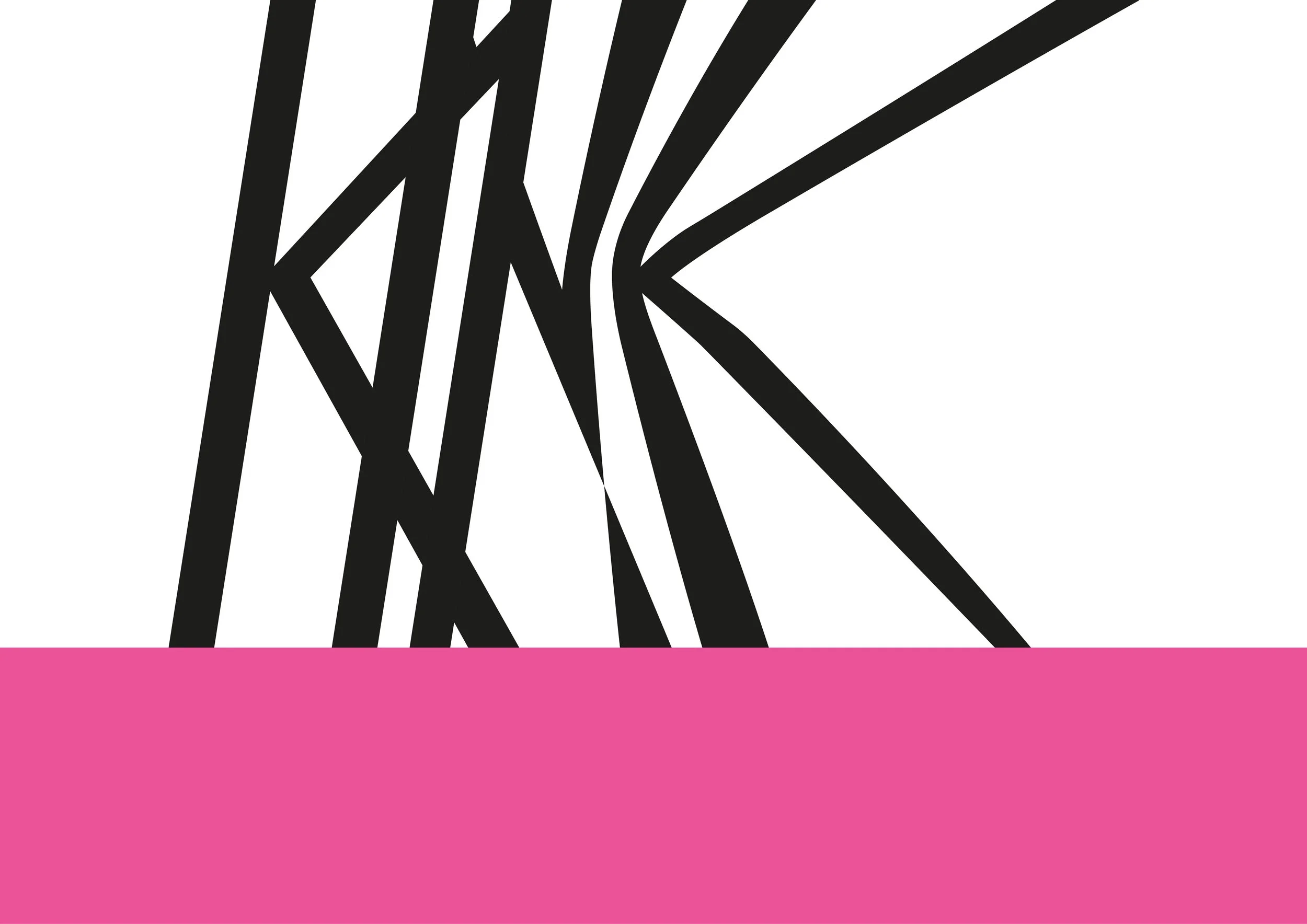
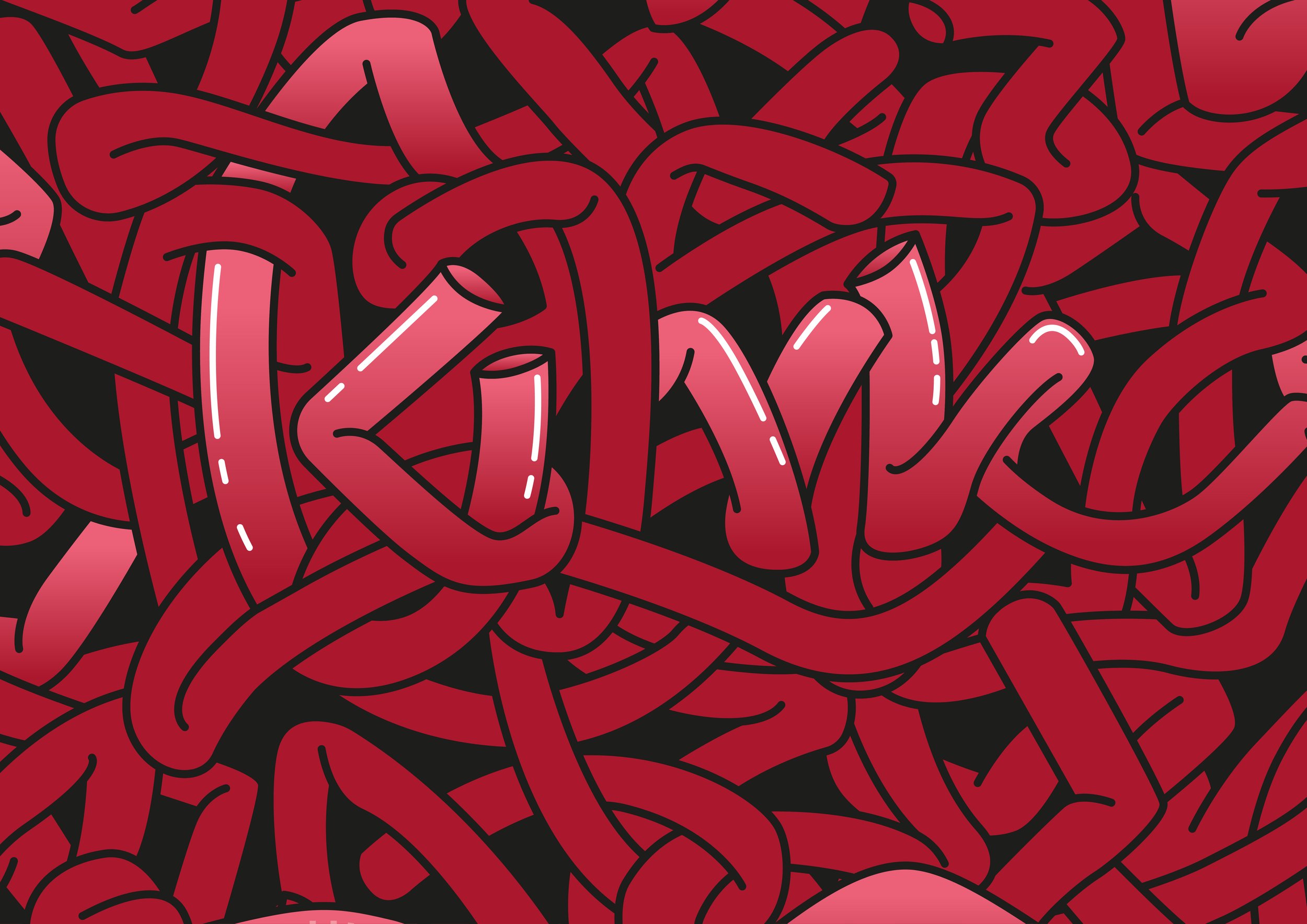
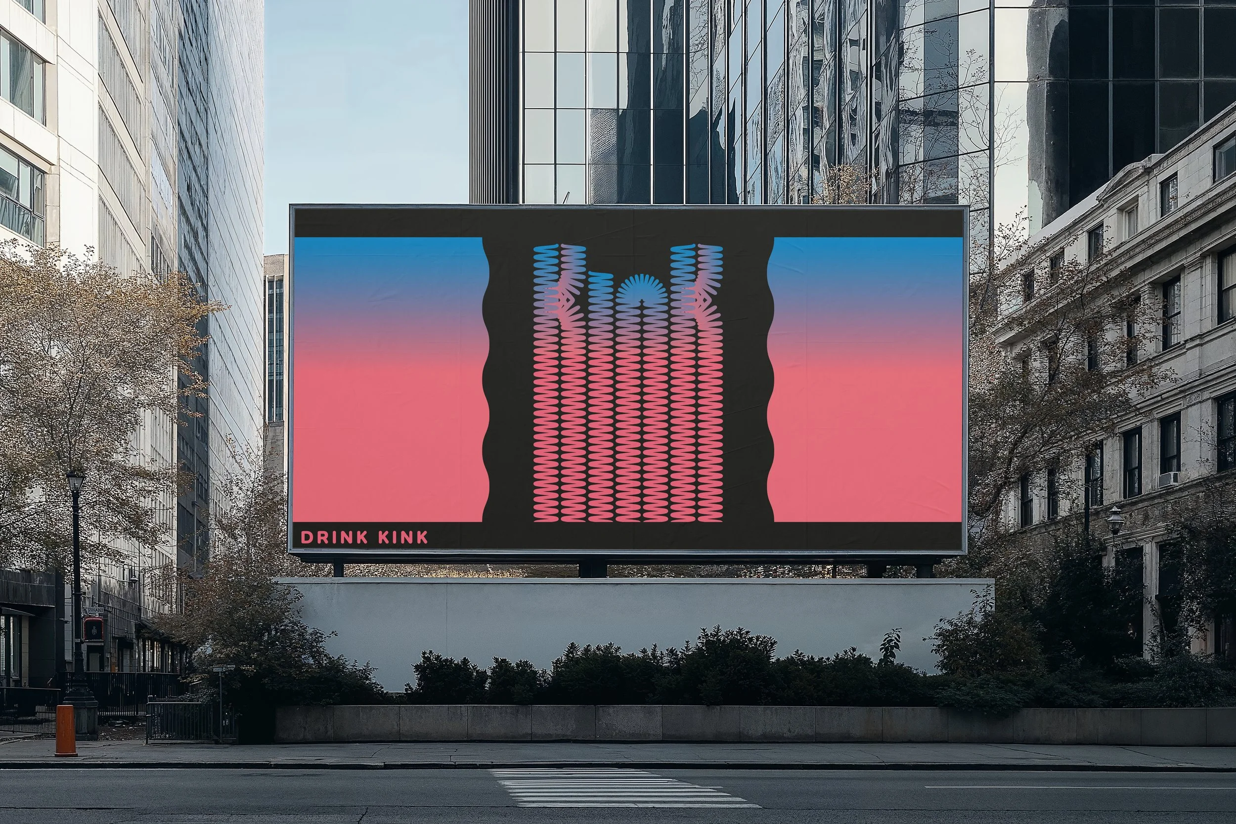
KINK
Making a dent in the soft drink world.
’KINK’ was one of two options for a new soft drink brand, we are still working with the client on the other, chosen, option, but we thought KINK was too good to pour down the drain and not share with the world!
KINK would be a range of non-alcoholic botanical drinks, mocktails for minors, or fizzy pops for parents? It’s either. It’s both. What’s your flavour kink?
Here’s a look at some of the brand and packaging design development for KINK.


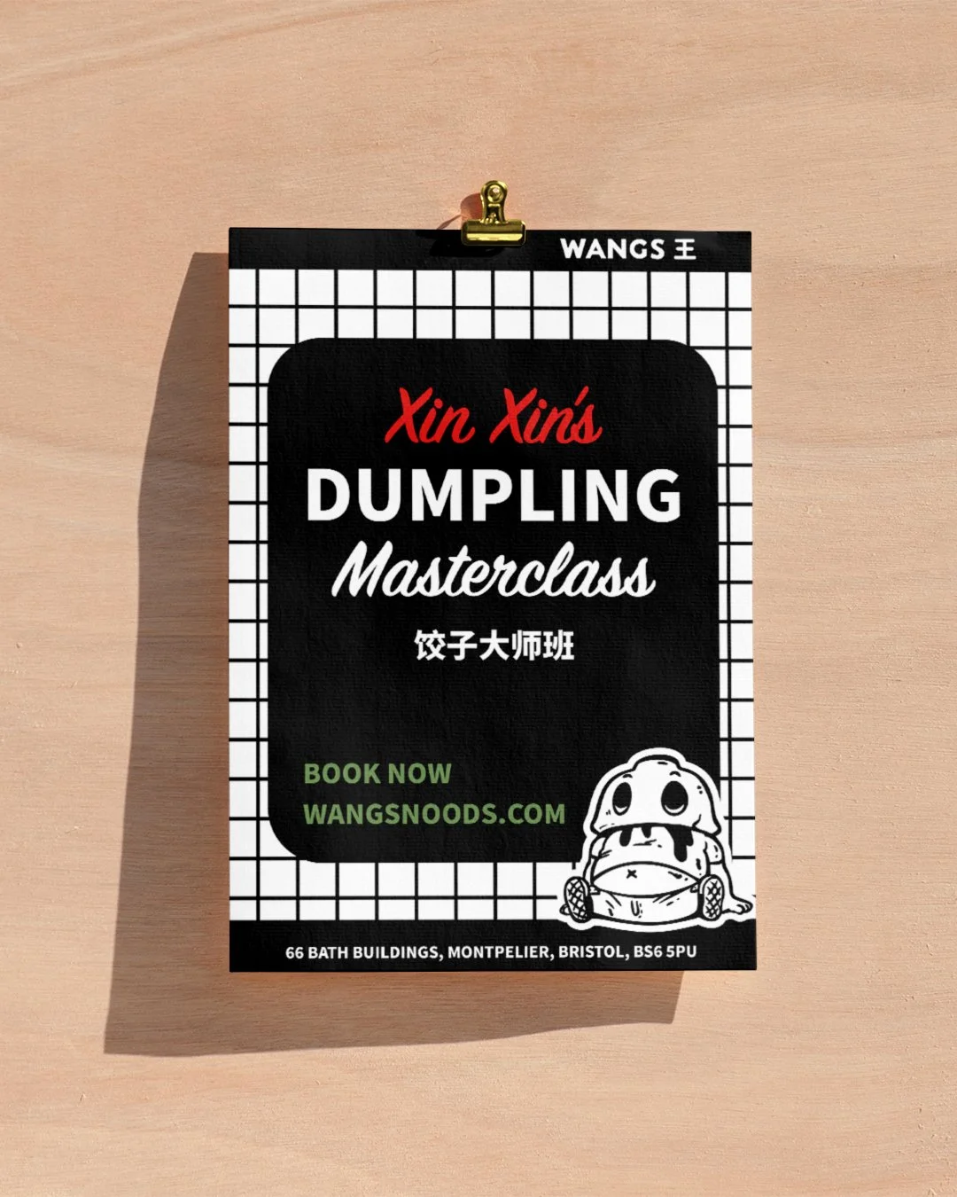
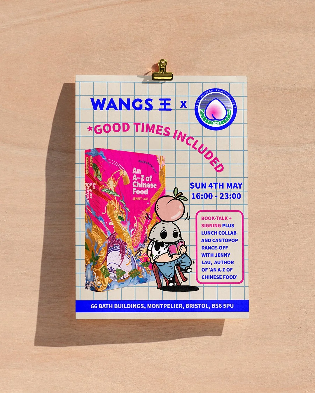
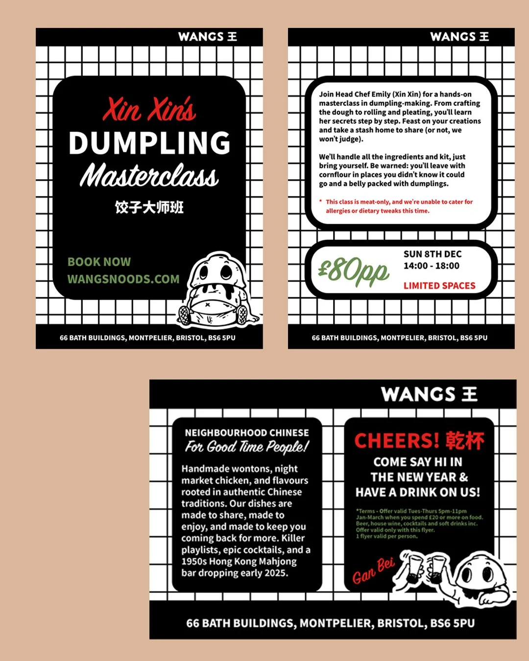
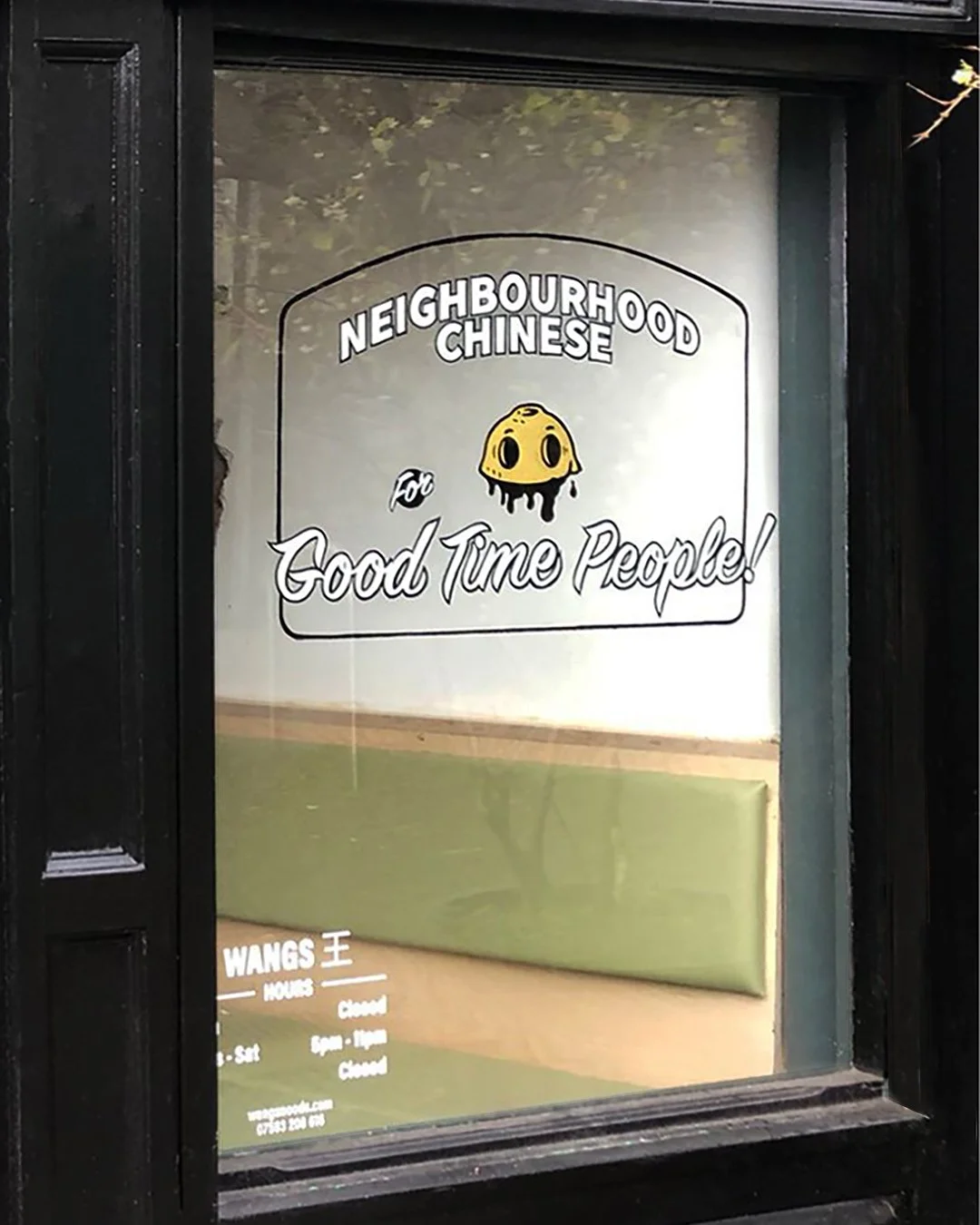
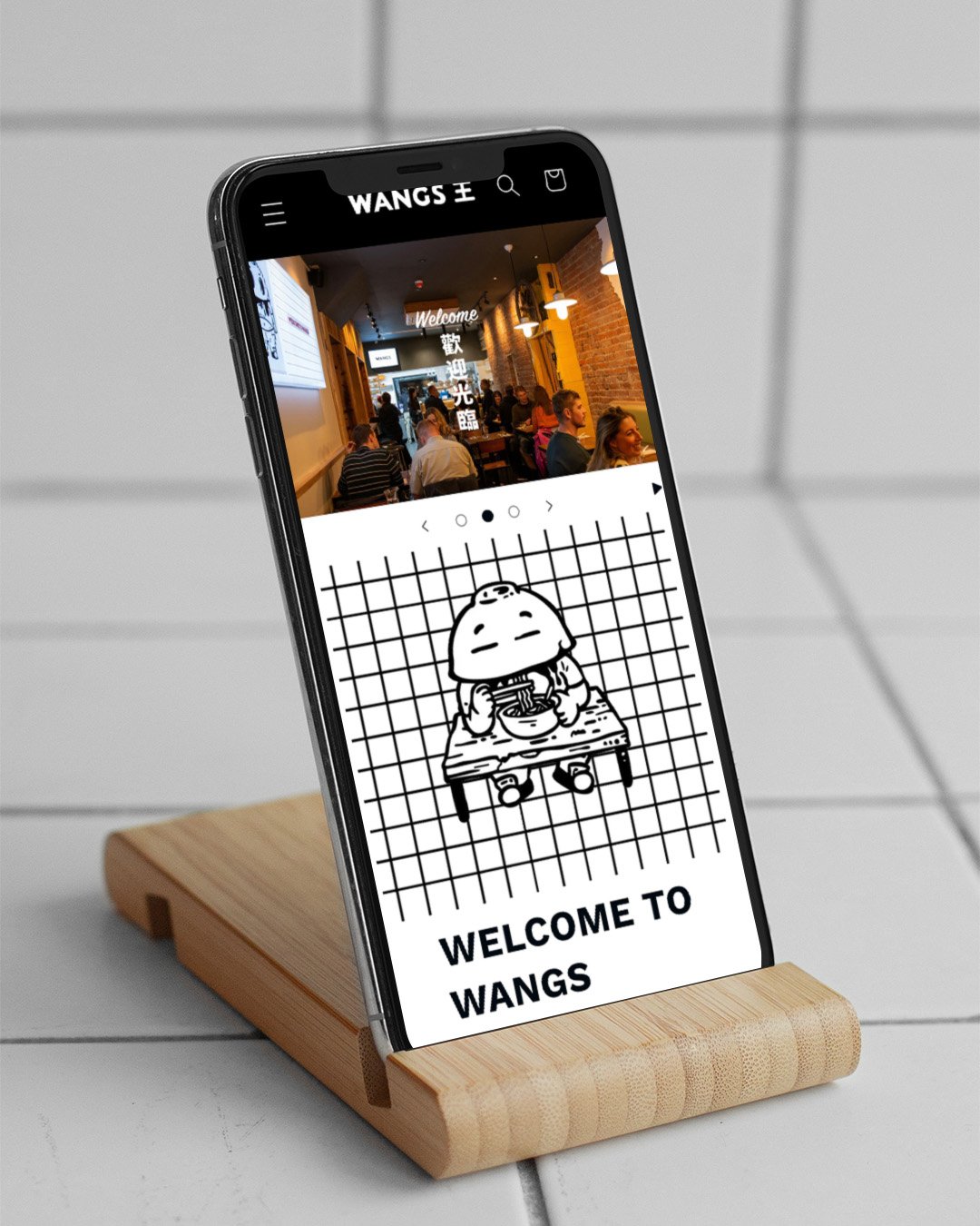
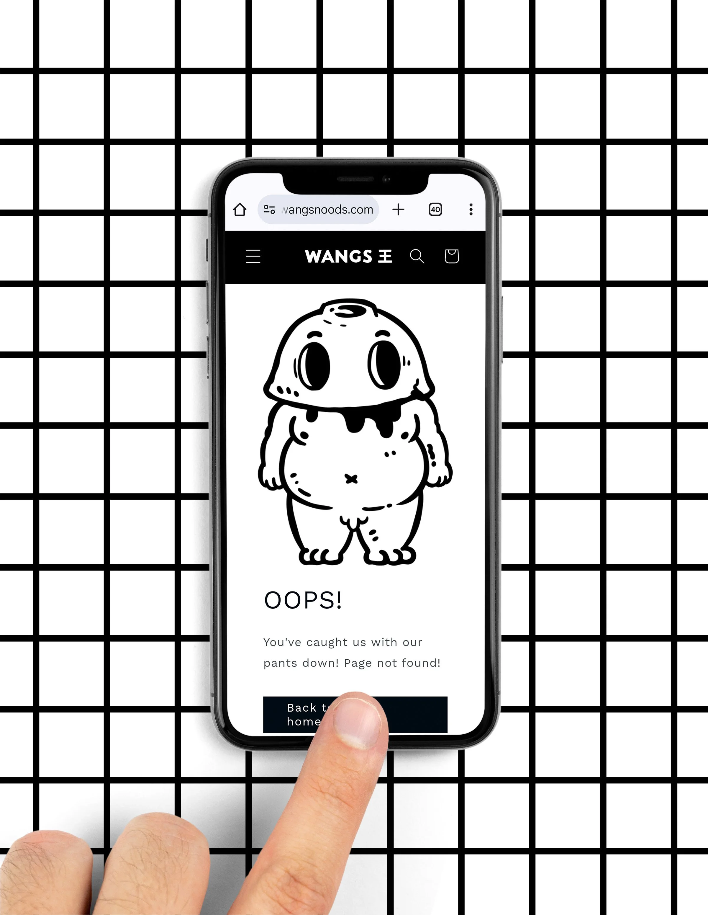
Wangs
Neighbourhood Chinese with serious flavour and a brand experience to match.
Wangs is a brilliant little universe of food, culture, and good times, built in Bristol, rooted in Hong Kong.
Together we shaped the full brand experience: creative direction, story, tone, visual identity, interiors, printed materials, digital assets, and a slick new website.
We brought together cultural depth and cheeky energy, working closely with the team (and original ‘Bowlman’ character work by artist Man Fei) to create a brand that’s as quirky, gutsy and community-driven as the food itself.
Today, Wangs isn’t just a restaurant, it’s a cultural hangout with a growing cult following.
We’re proud to keep shaping the creative direction as it grows.


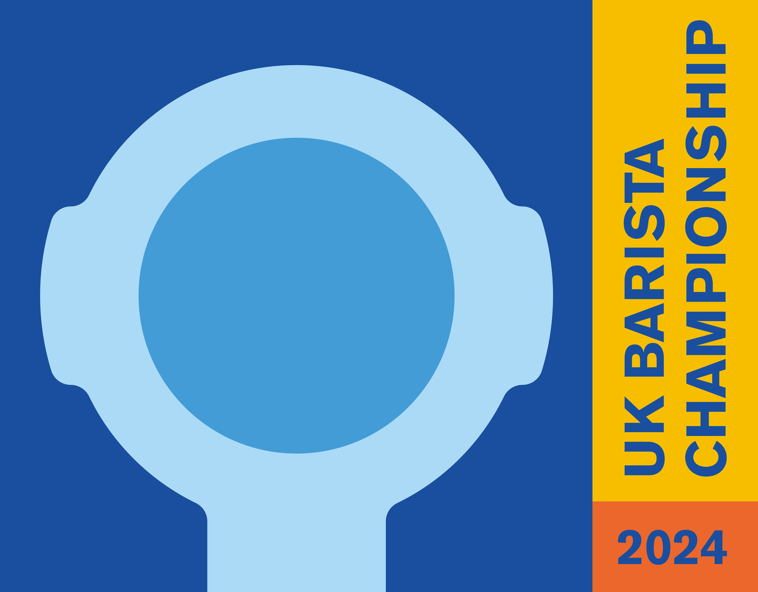
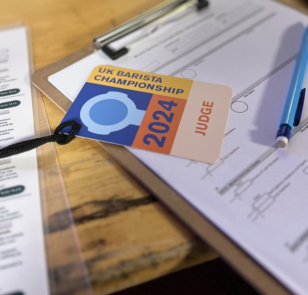
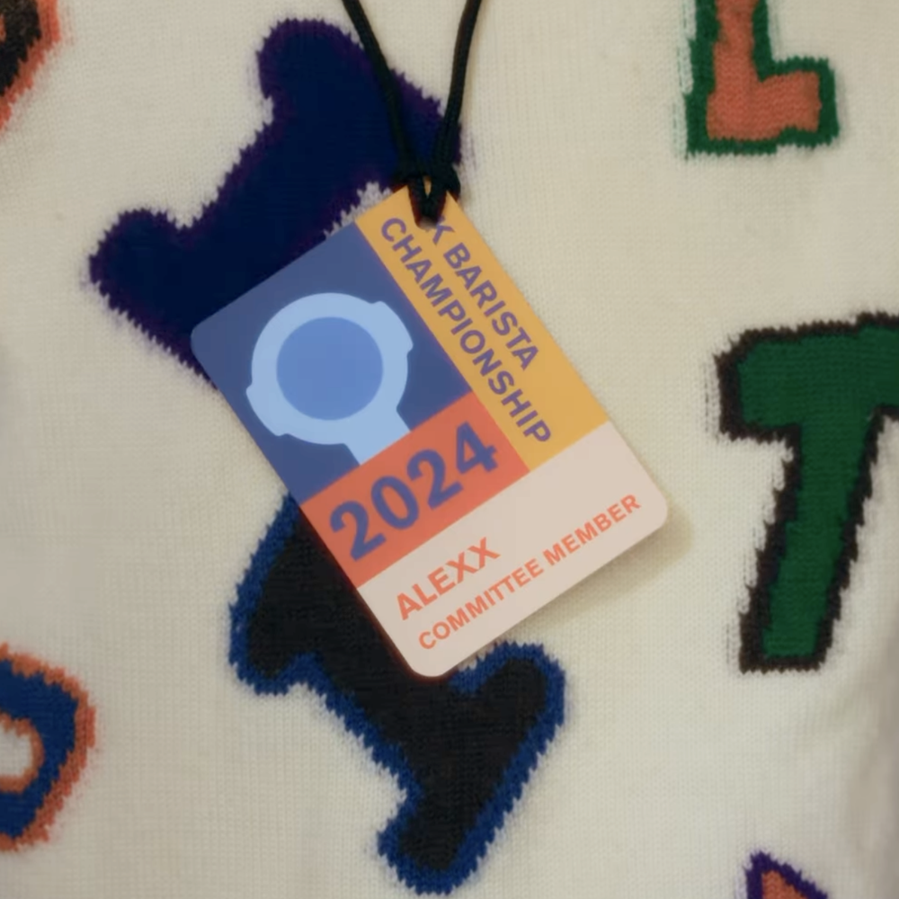
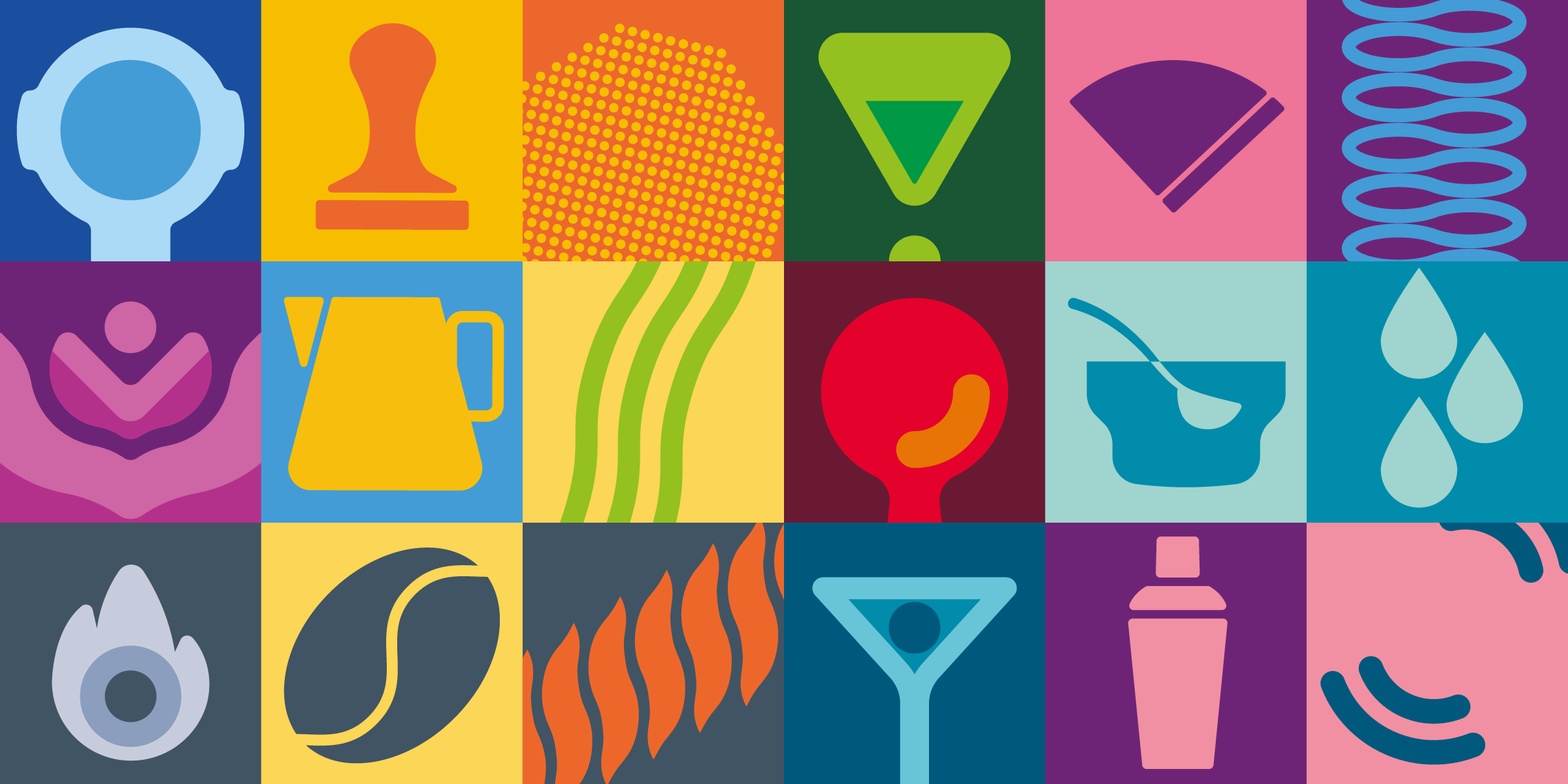
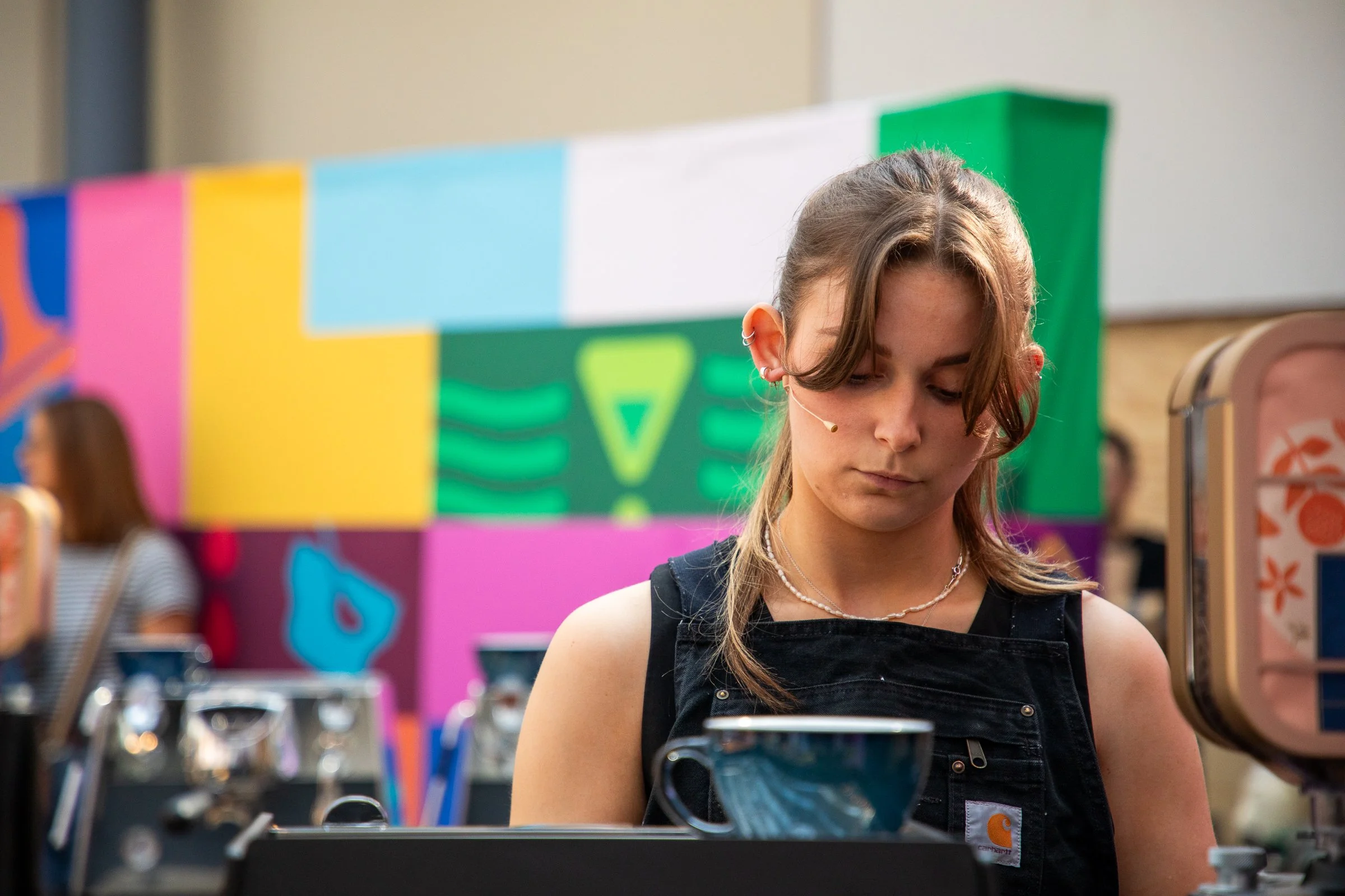
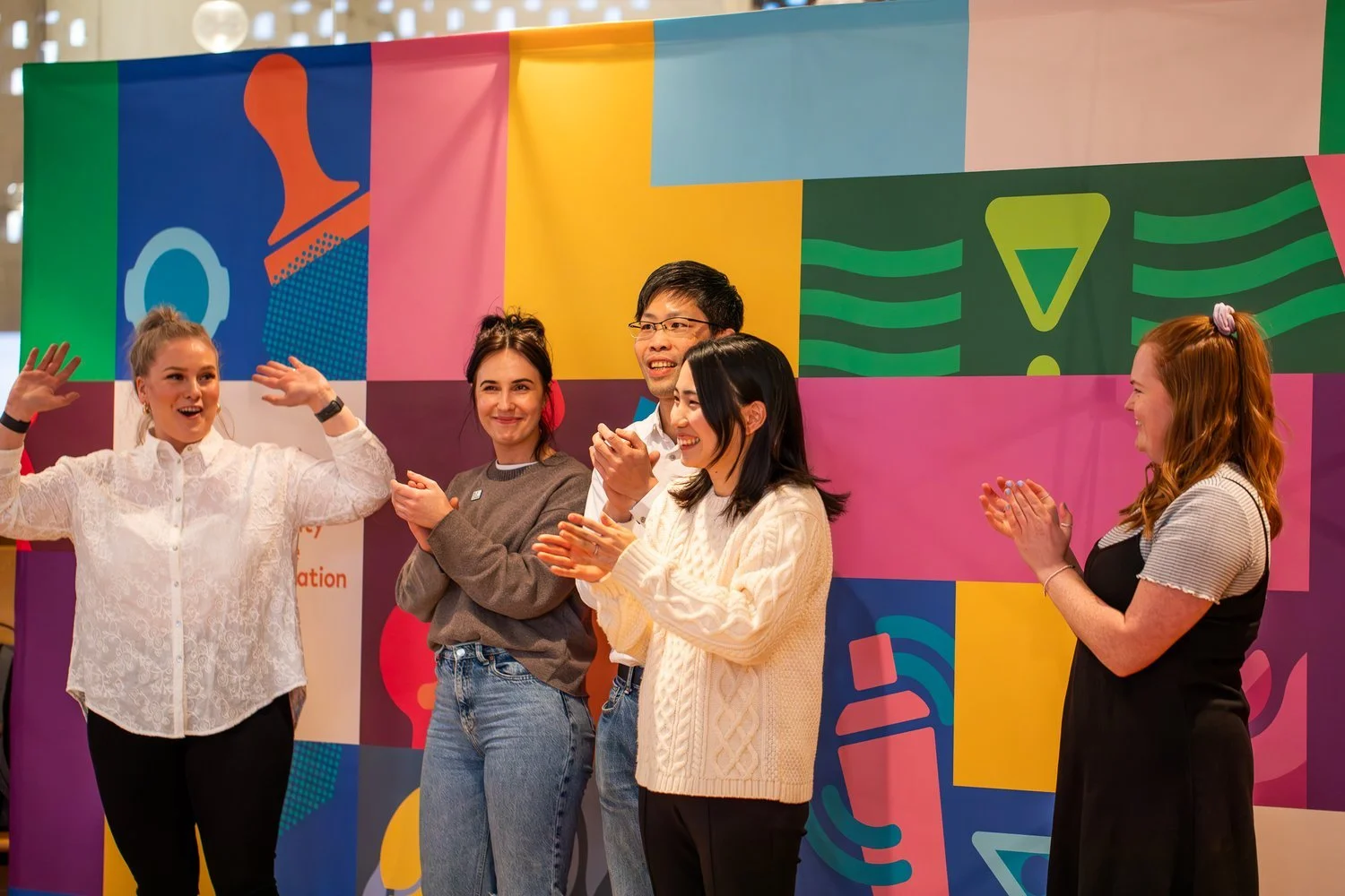
Specialty Coffee Association UK
A full-stage visual world for the best in British coffee.
Ben was commissioned by the Specialty Coffee Association to design the full visual identity and illustration system for the UK Barista Championships, the biggest event in the British coffee calendar.
From stage graphics to signage, merch to lanyards, programmes to social media - he built a full-stage brand experience, designed to capture the creativity, craft, and high-energy culture of barista life.
The result? A vibrant, graphic identity that gave the stage its own energy - full of colour, character, and life.


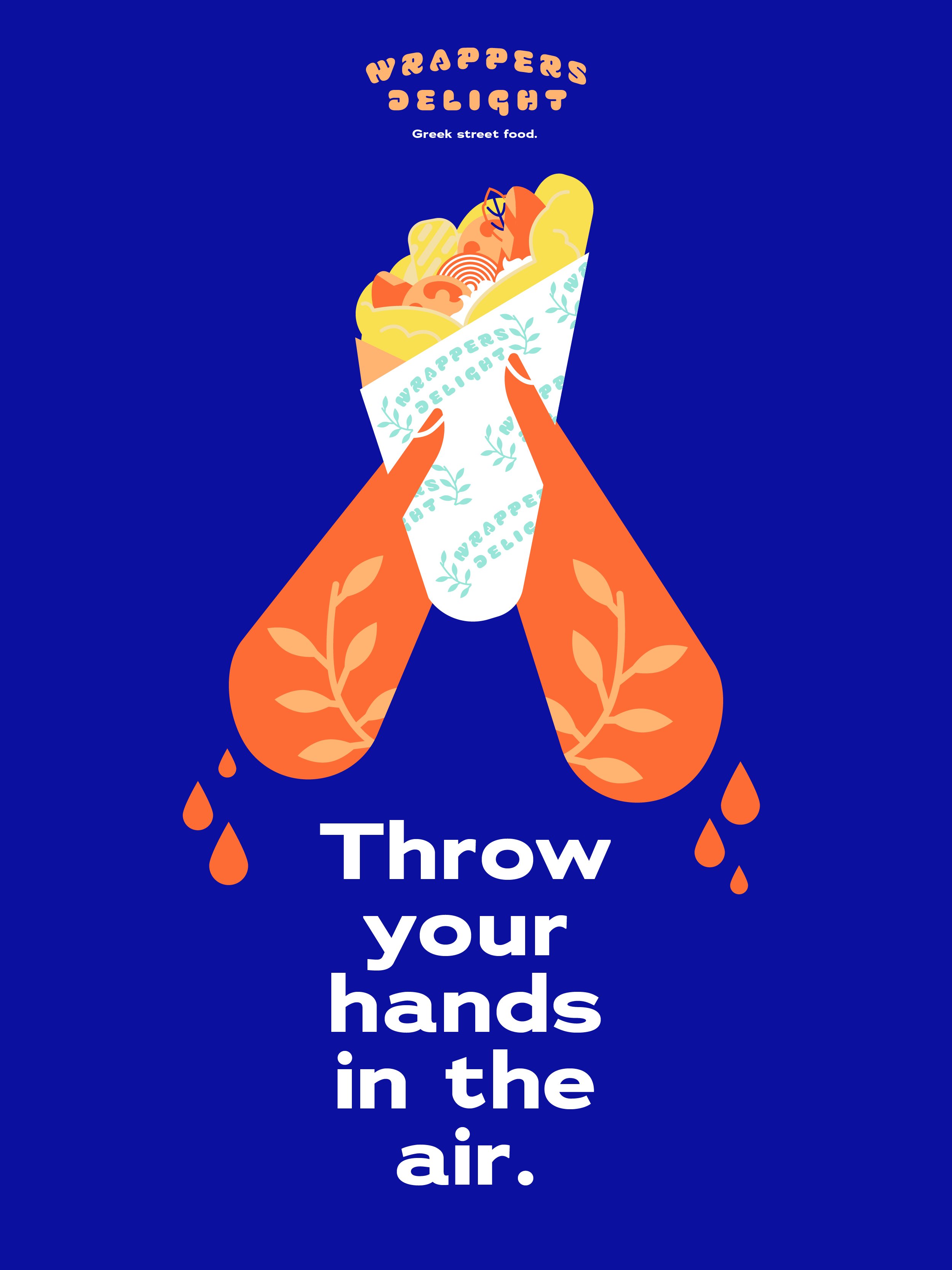
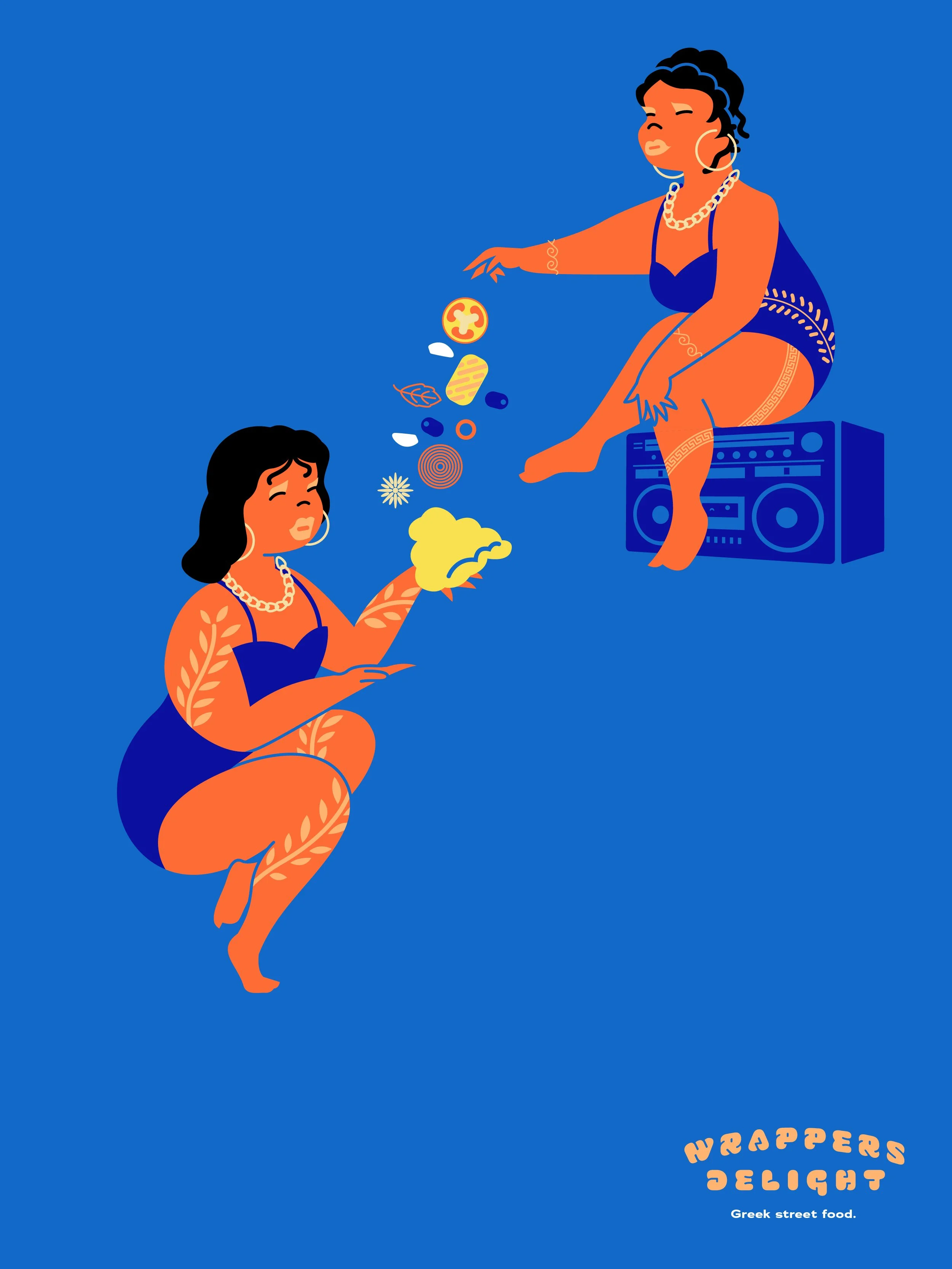
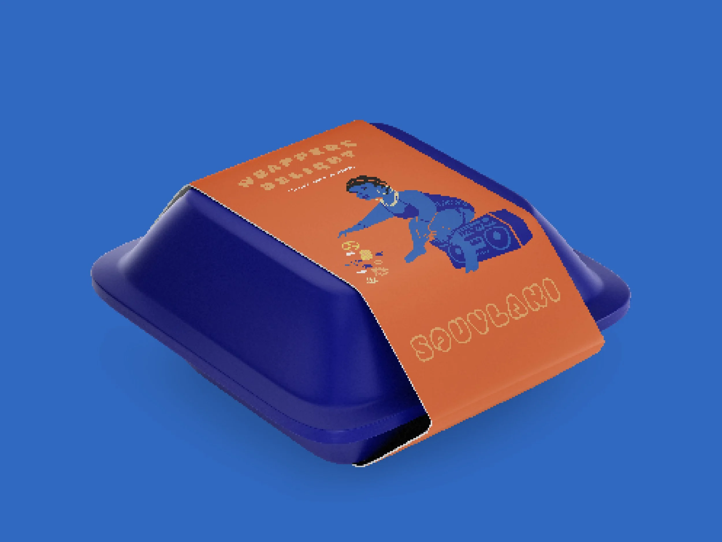
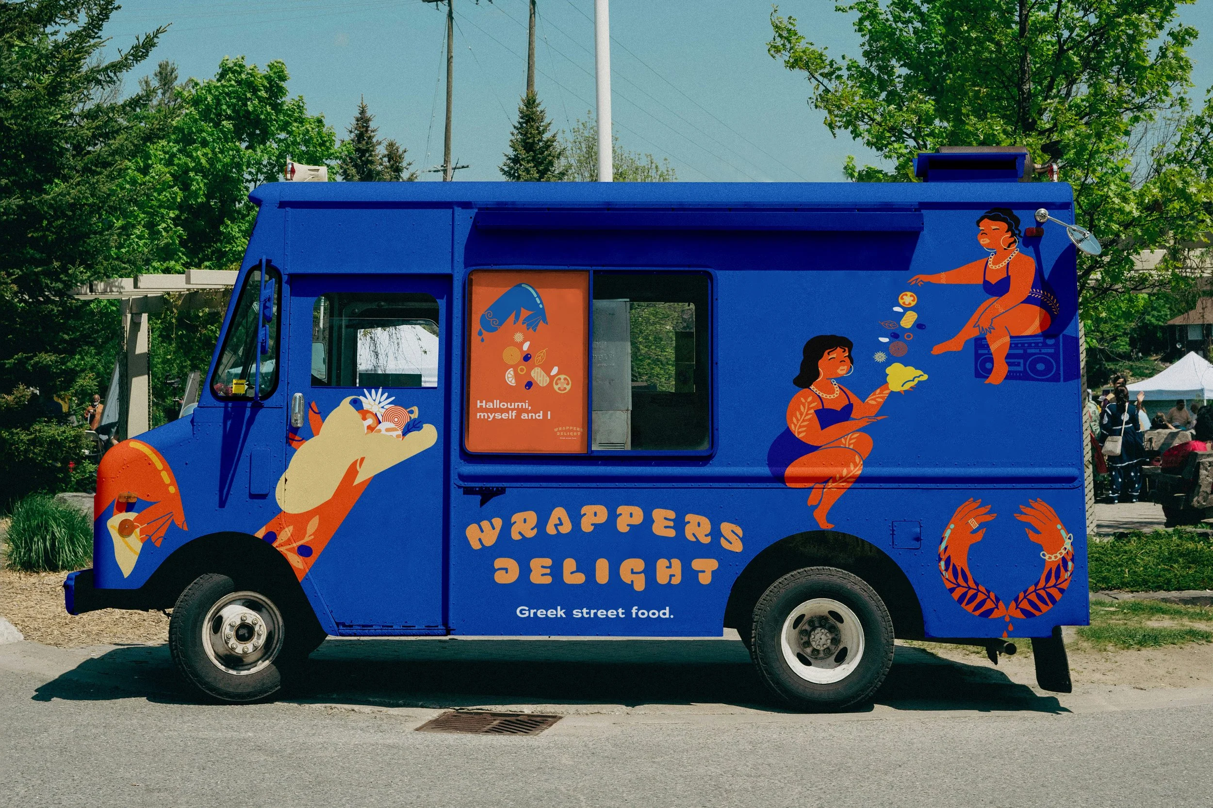
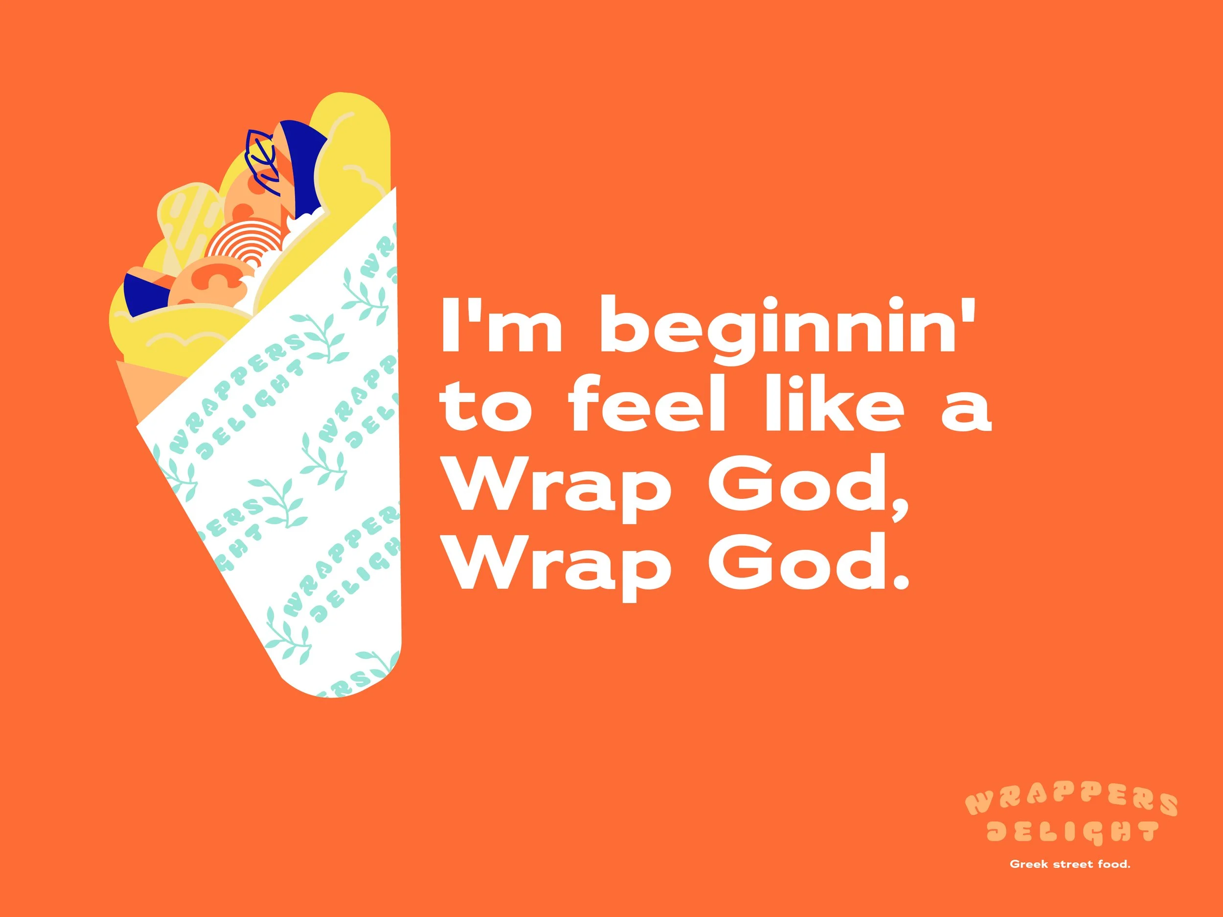
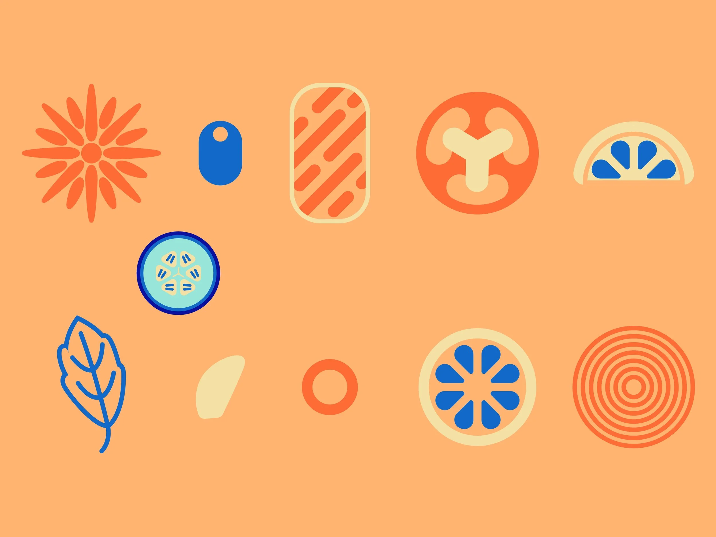
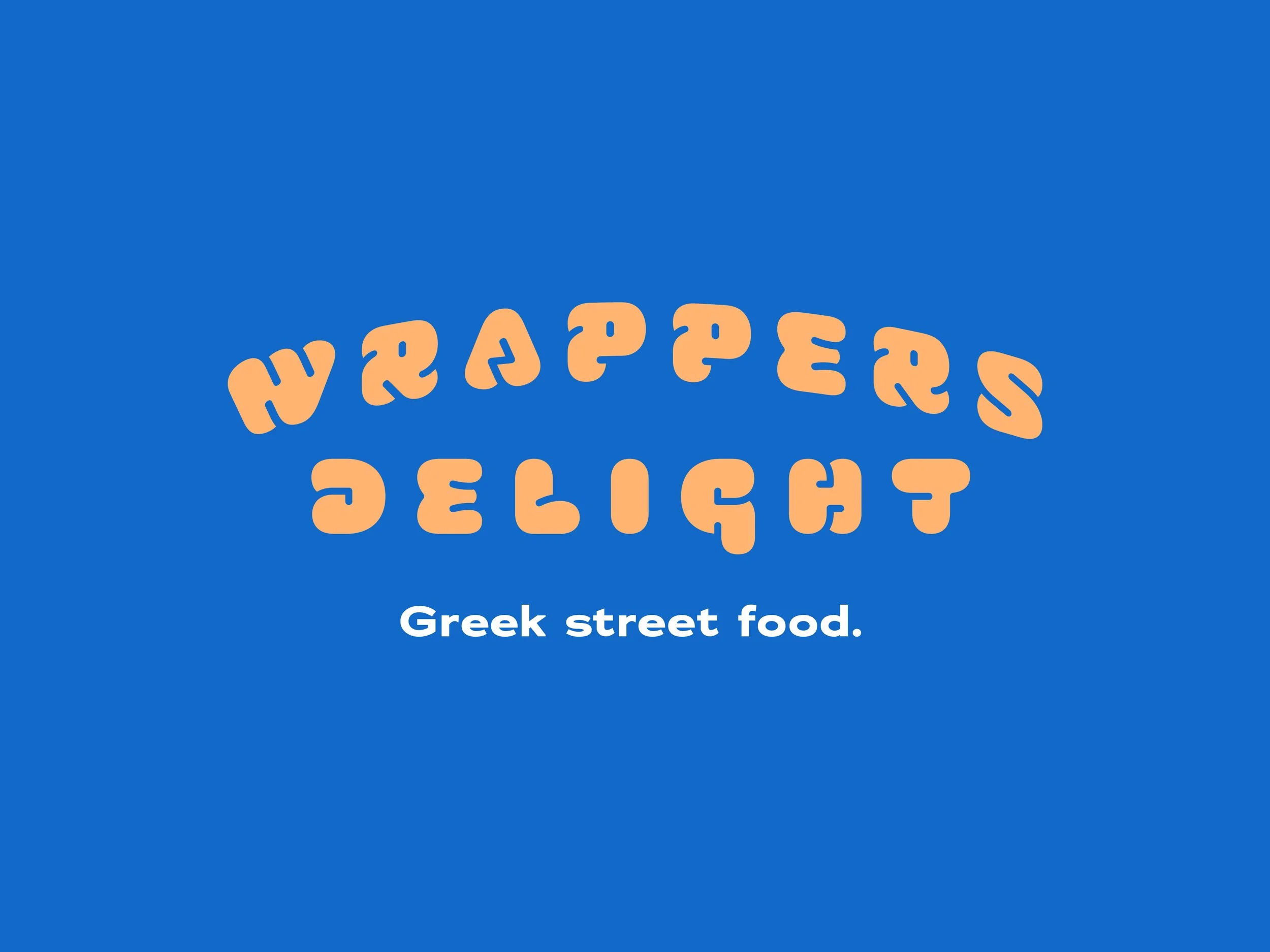
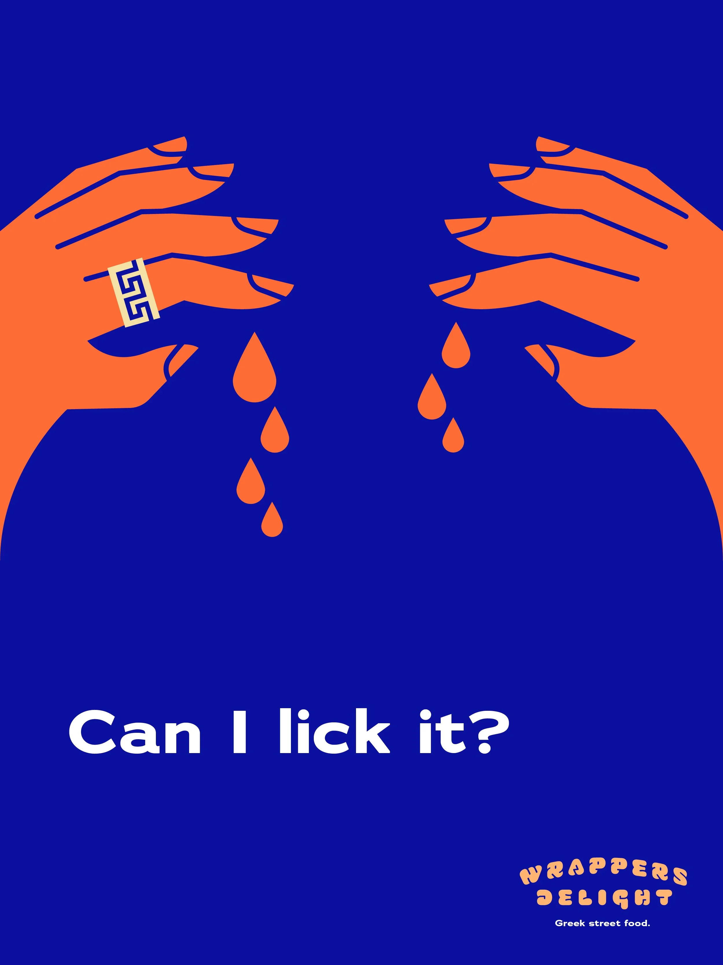
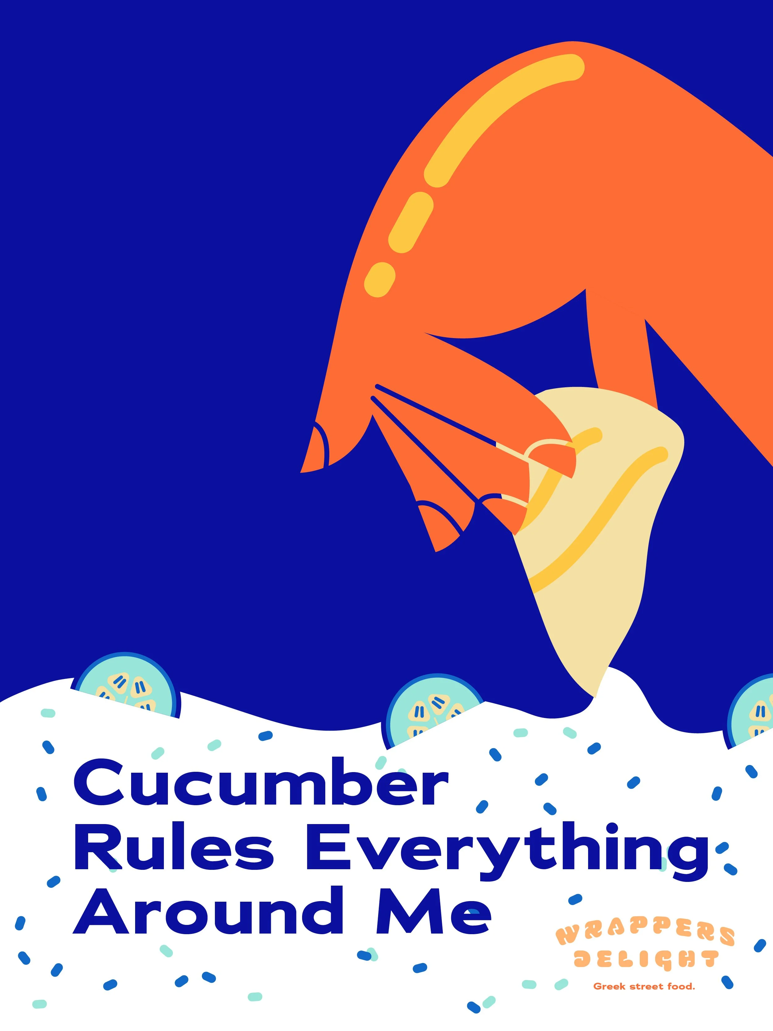
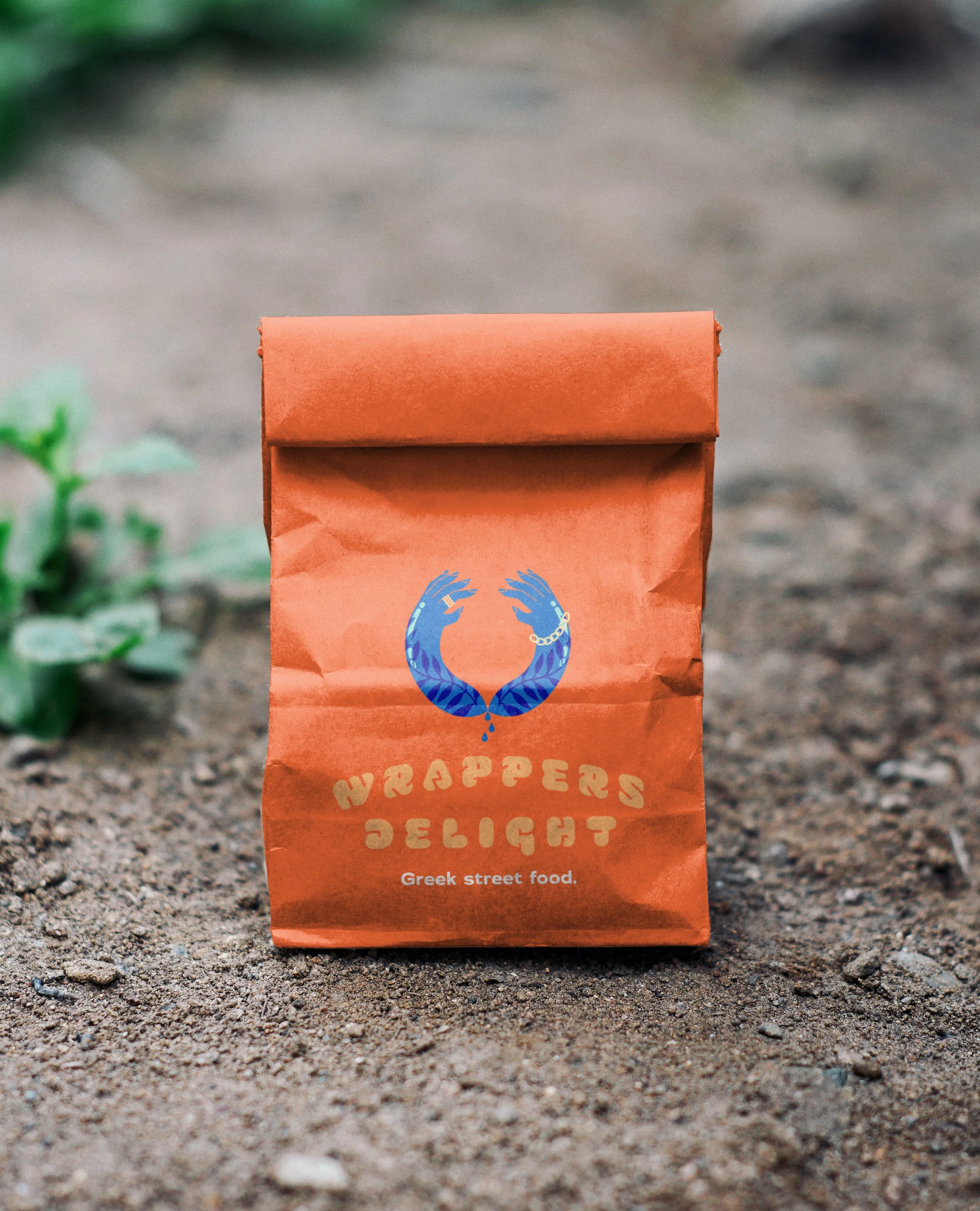
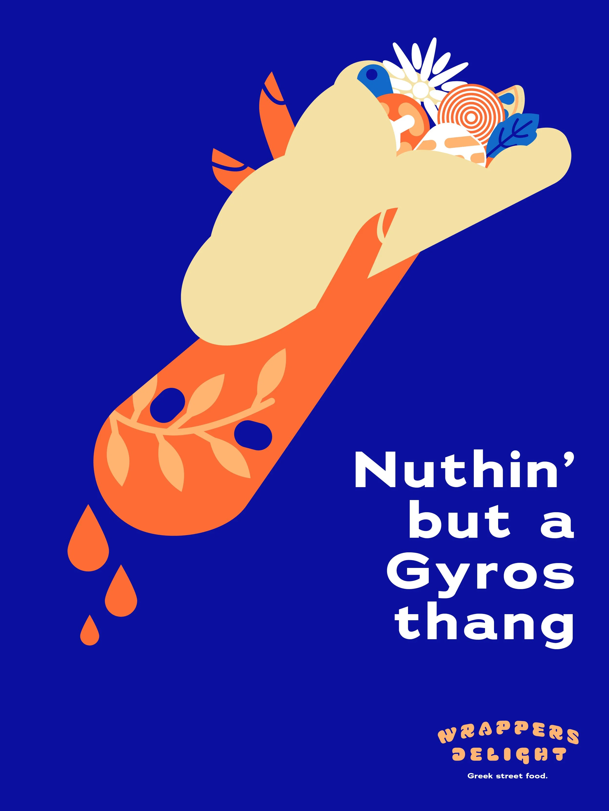
WRAPPERS DELIGHT
Ancient icons. Street-level swagger. A full-flavour brand concept built to stand out.
We created Wrappers Delight as a full brand identity for a Greek wrap street food company wanting to level up - from naming to a full visual world. Think ancient goddesses remixed through a contemporary, hip-hop lens: mythic, magnetic, and ready to rule the streets.
The visual system blended classic Greek symbolism with modern-day street culture, creating a brand that felt iconic, defiant, and dripping with its own mythology.
The client pivoted in a different direction but the full concept is ready and waiting to be snapped up by someone brave enough to run with it. Is that you?


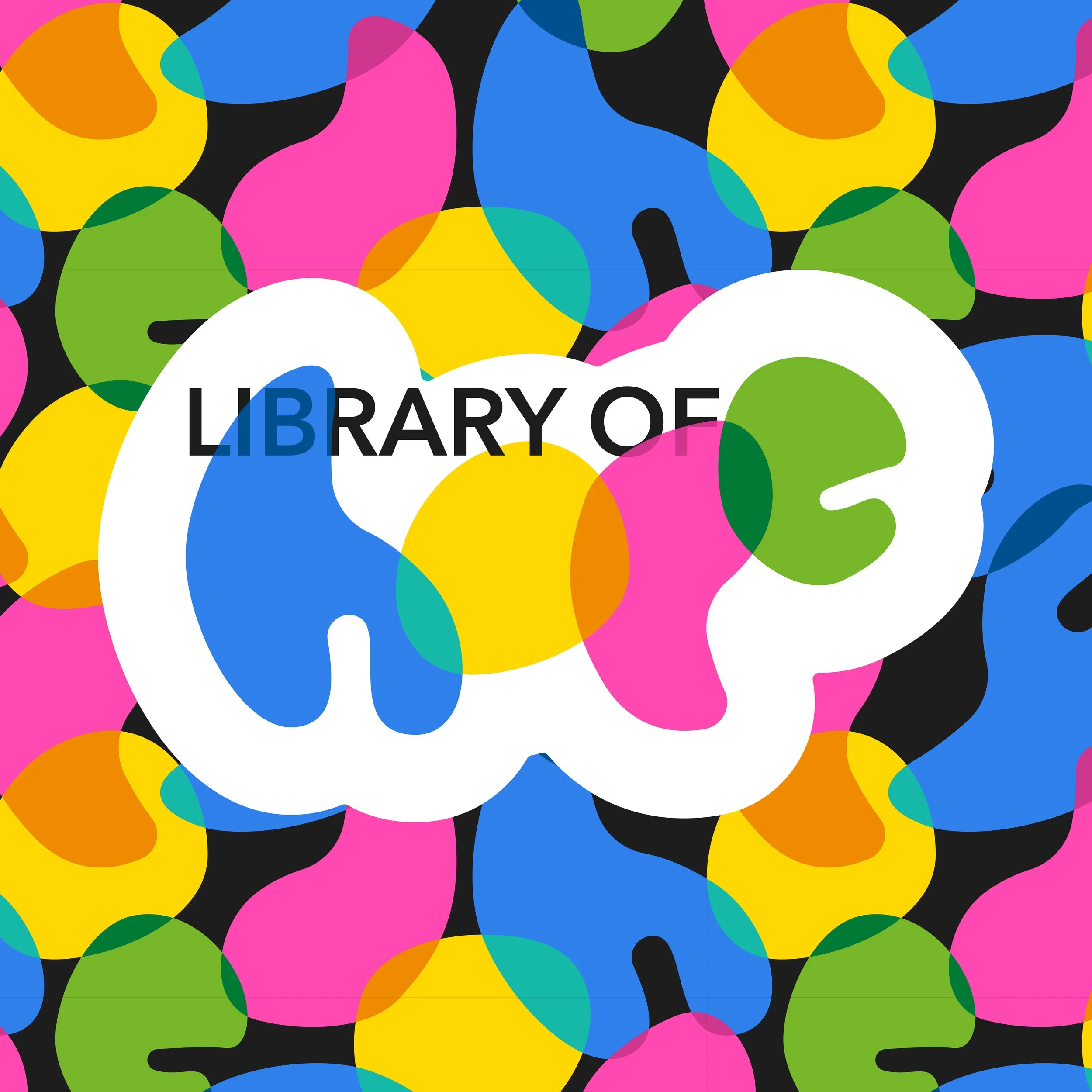
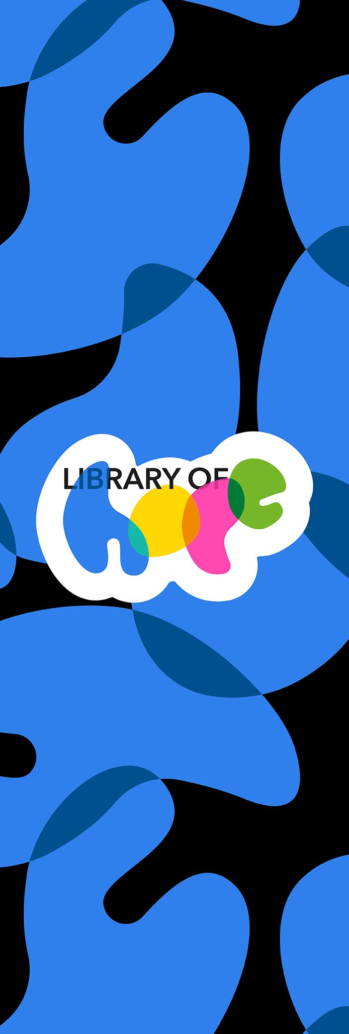
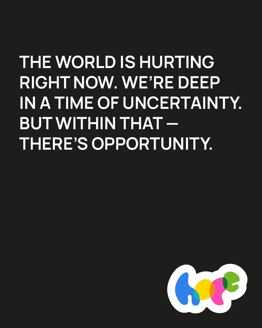
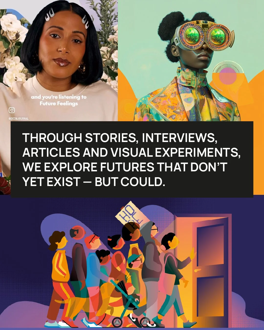
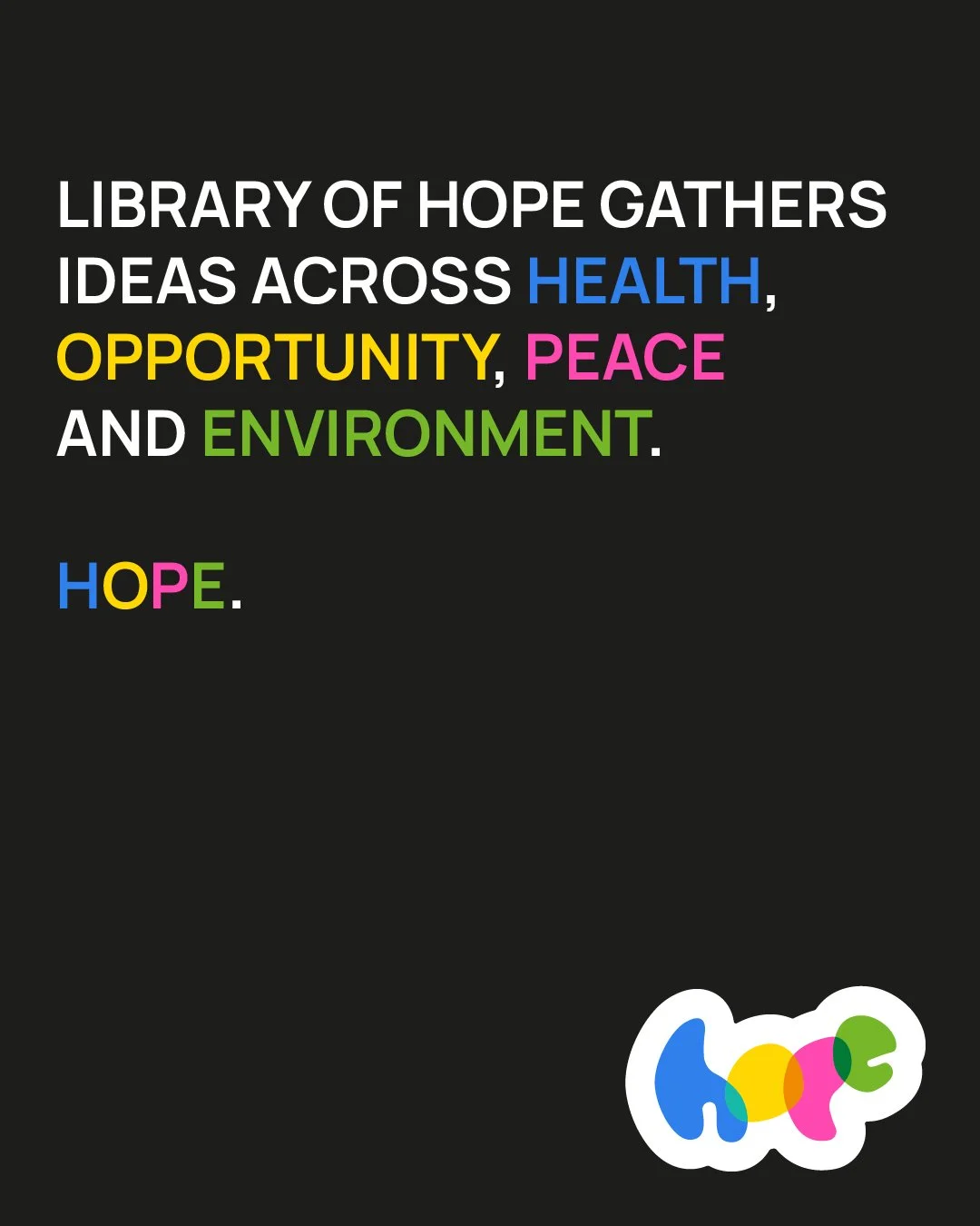
Library of Hope
A vision lab for a better future and a community built on imagination.
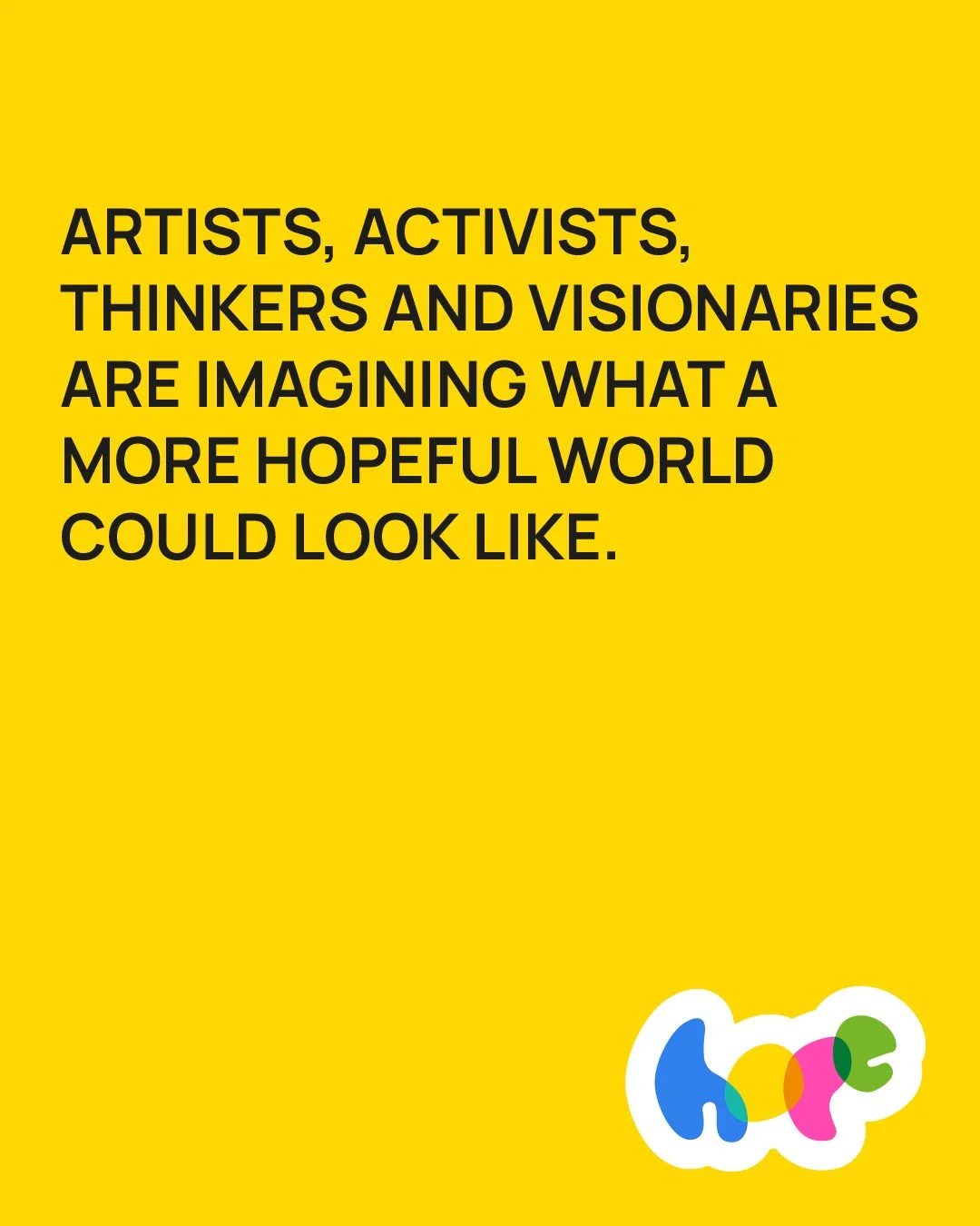
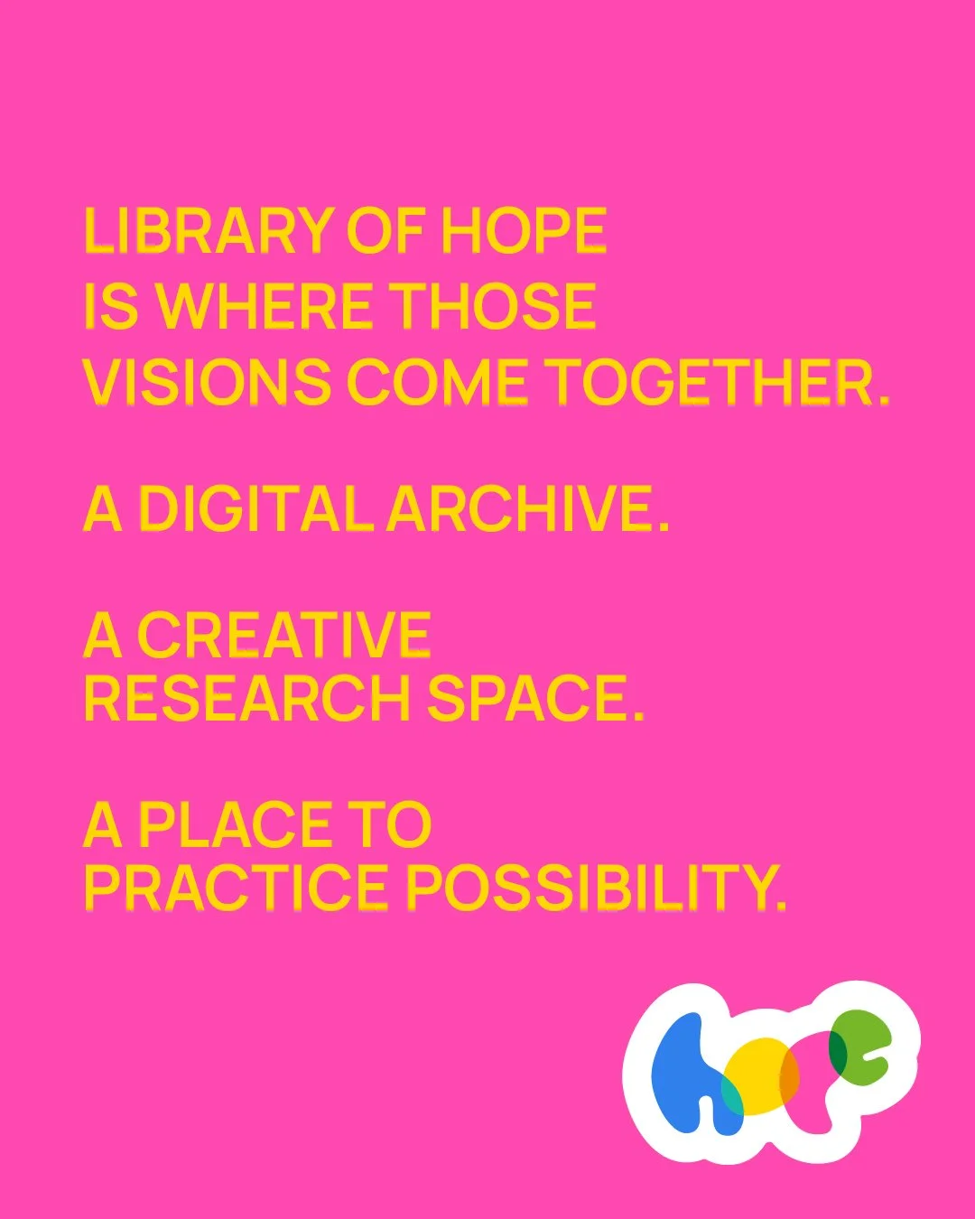
We partnered on the evolution of Library of Hope: a global storytelling project collecting visions of more hopeful, inclusive futures across health, opportunity, peace, and the environment.
Working closely with founder Trickey, we shaped the brand’s creative direction, developing the tone of voice, visual storytelling, editorial structure, and a platform that could grow with the project.
We are also developing the soon to launch HopeCast podcast - interviewing future-shapers across culture, activism, and design, and expanding Library of Hope’s reach into new conversations and new communities.
From big picture brand thinking to website structure, content writing, social media creative, and podcast program development, we helped Library of Hope grow from a loose idea into a full movement: a living archive of better possibilities.


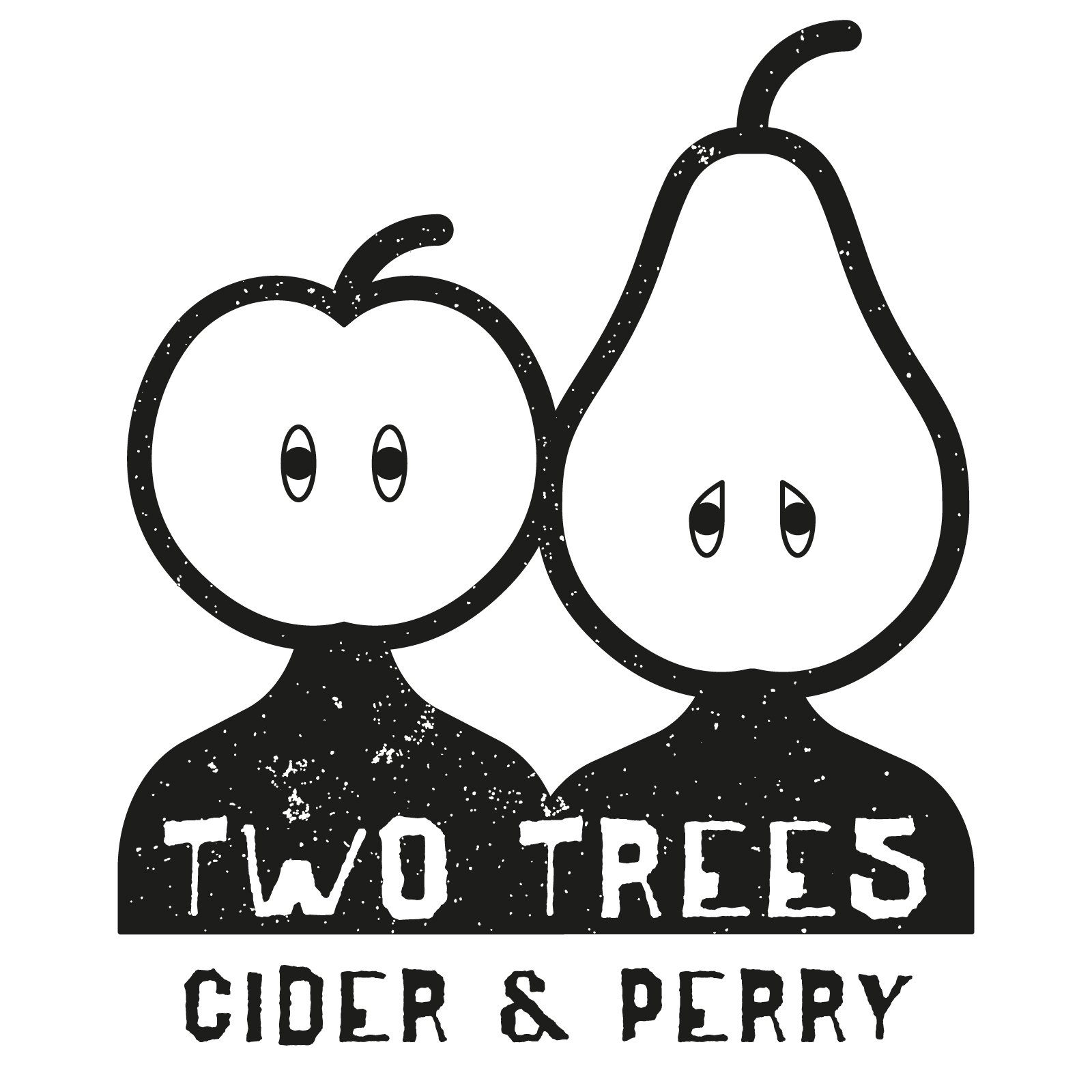
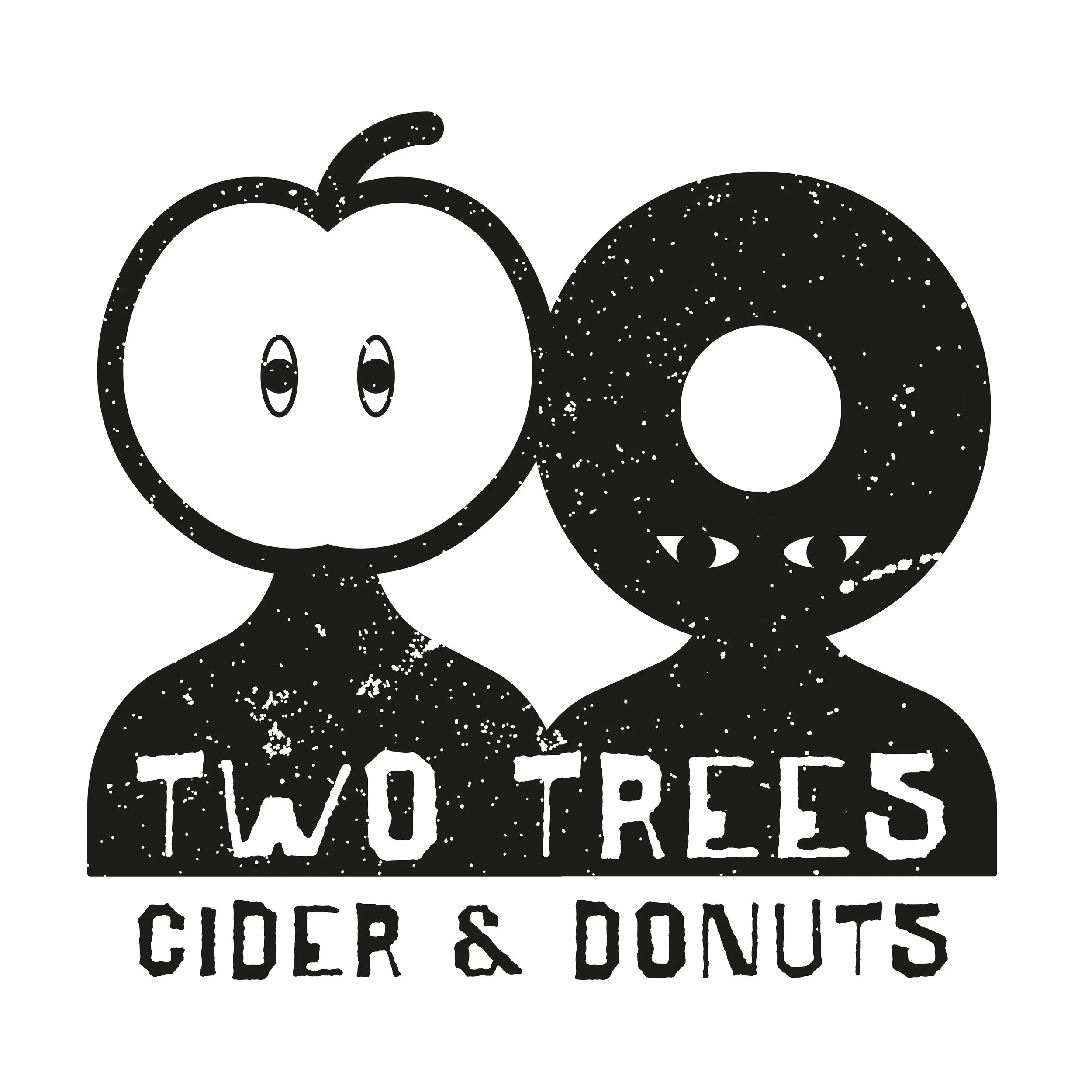
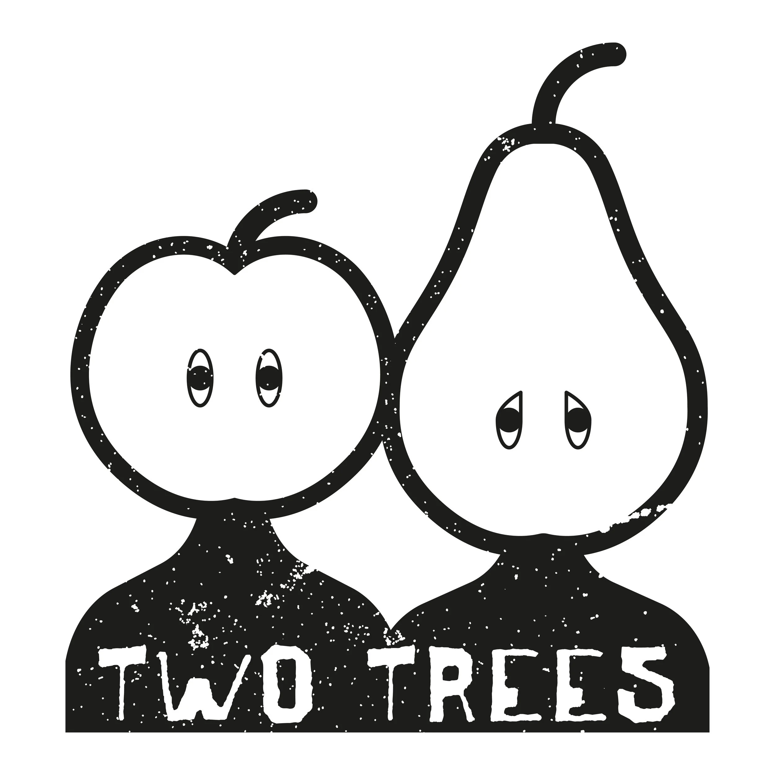
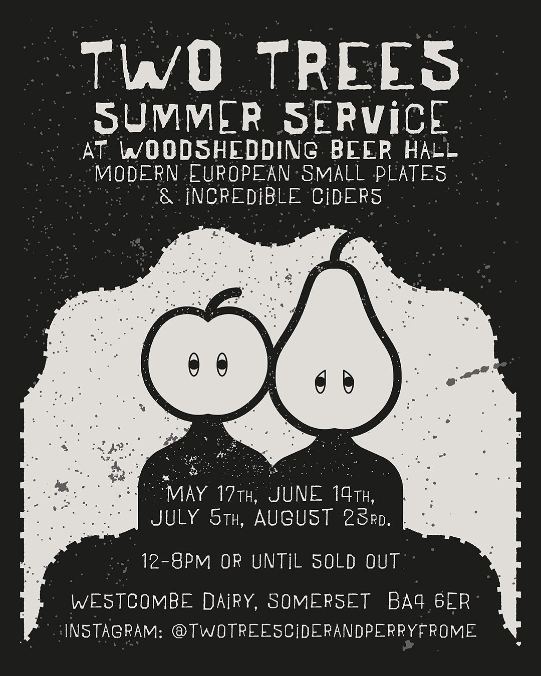
Two Trees Cider & Perry
A new kind of cider curators and a brand made to grow with them.
Two Trees is an incredible start-up from local legends - bringing brilliant small-batch cider and perry to the table, pairing rare finds with seasonal food, community pop-ups, and a big dose of Somerset spirit.
We worked with the founders from day one, creating a brand that feels effortless, local, and just the right amount of offbeat.
From logo design to creative direction for posters, menus, and events, we’re building a visual world that captures what Two Trees is all about: discovery, good times, and cider worth sharing with friends.
A brand built to travel - from orchards to pop-ups to whatever wild ideas come next.


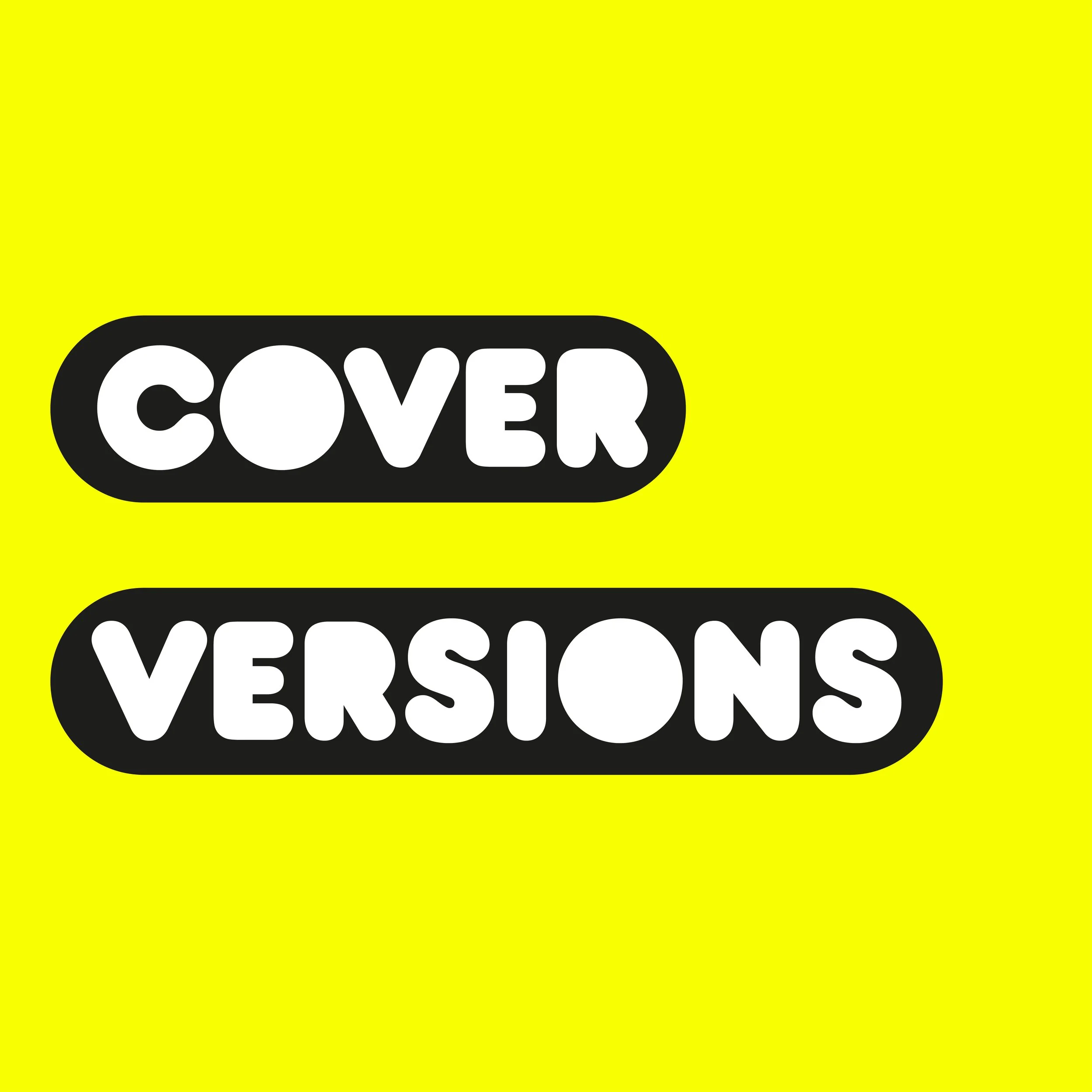
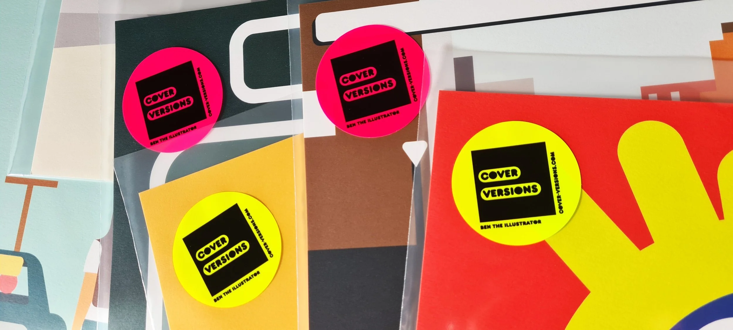
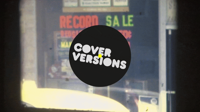
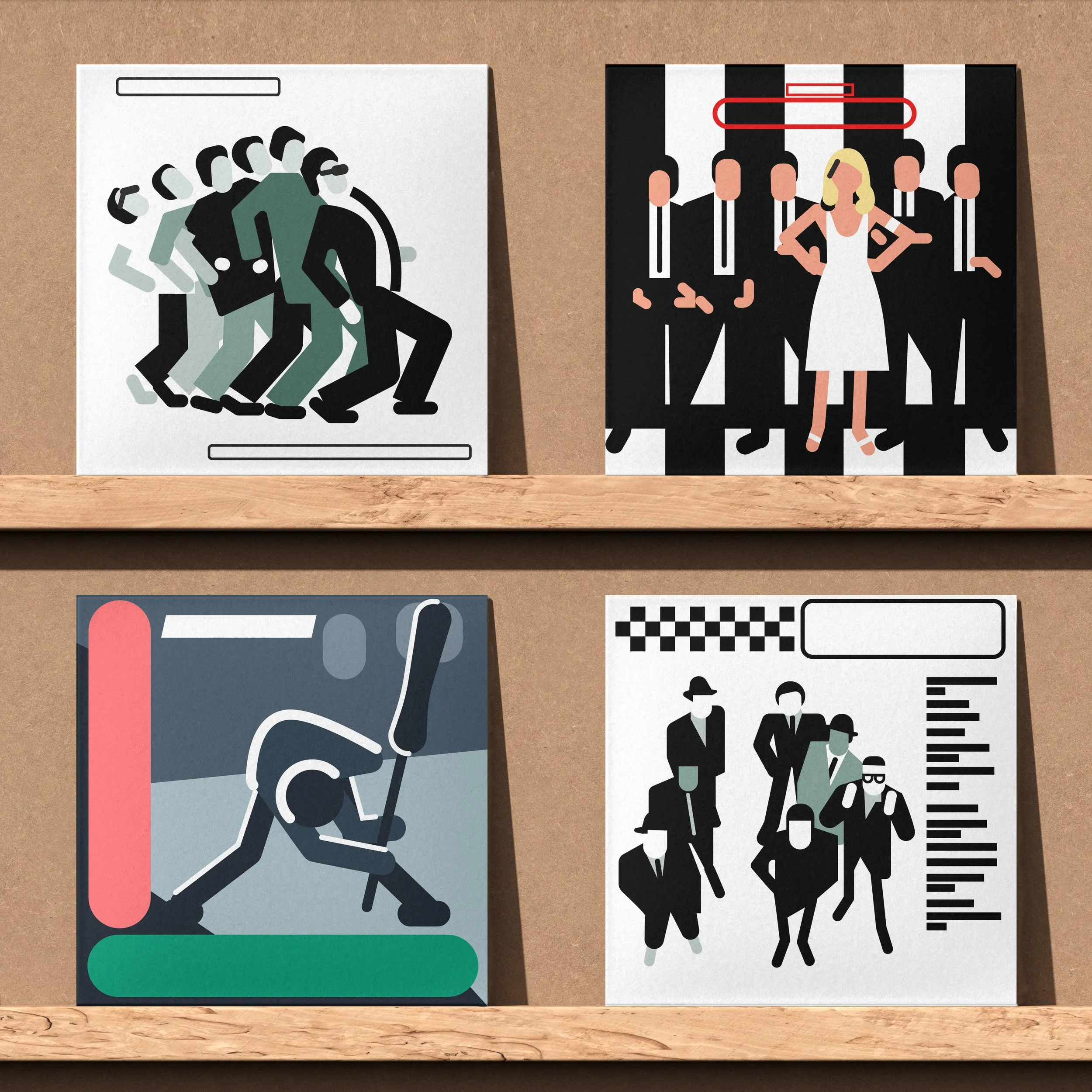
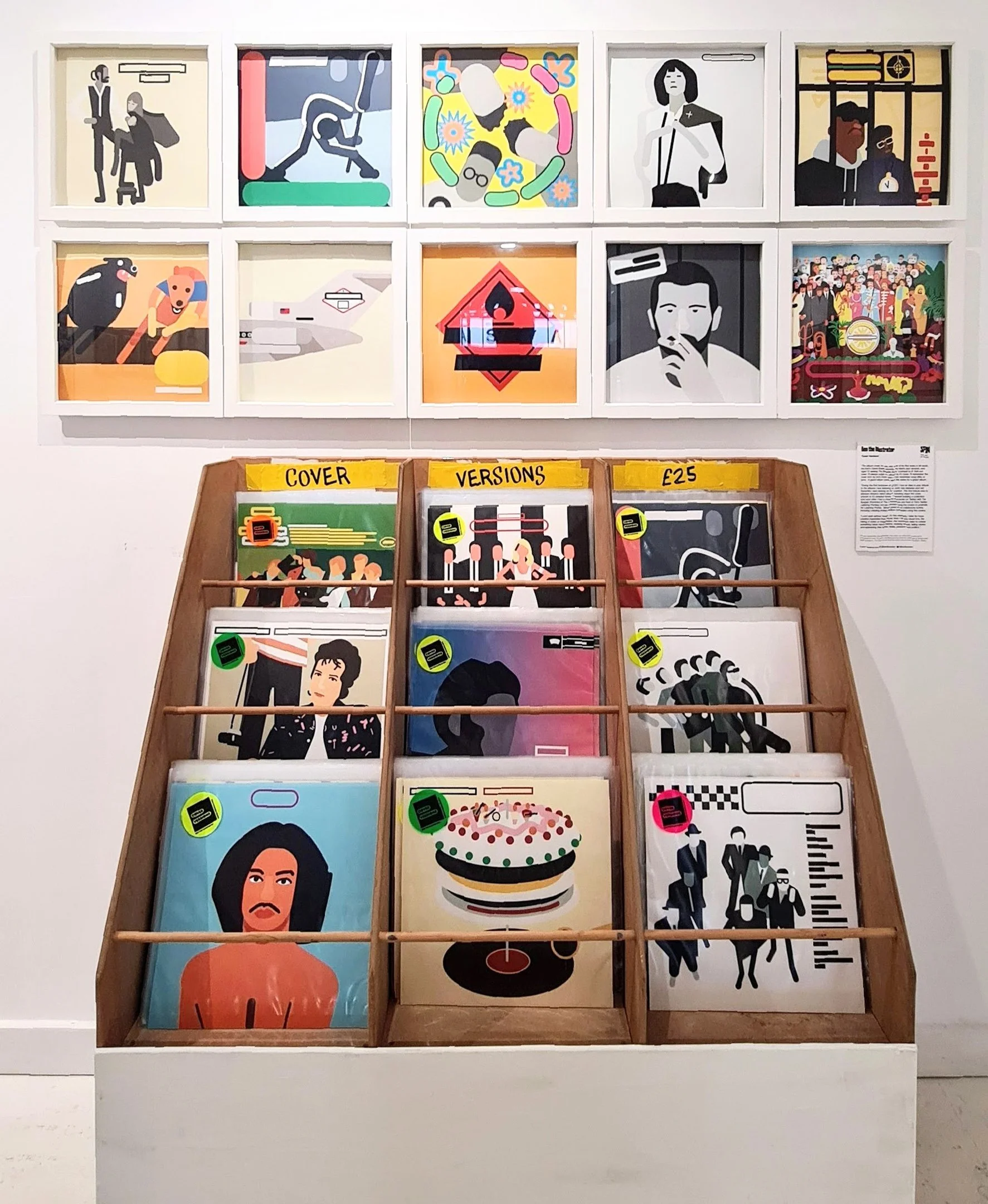
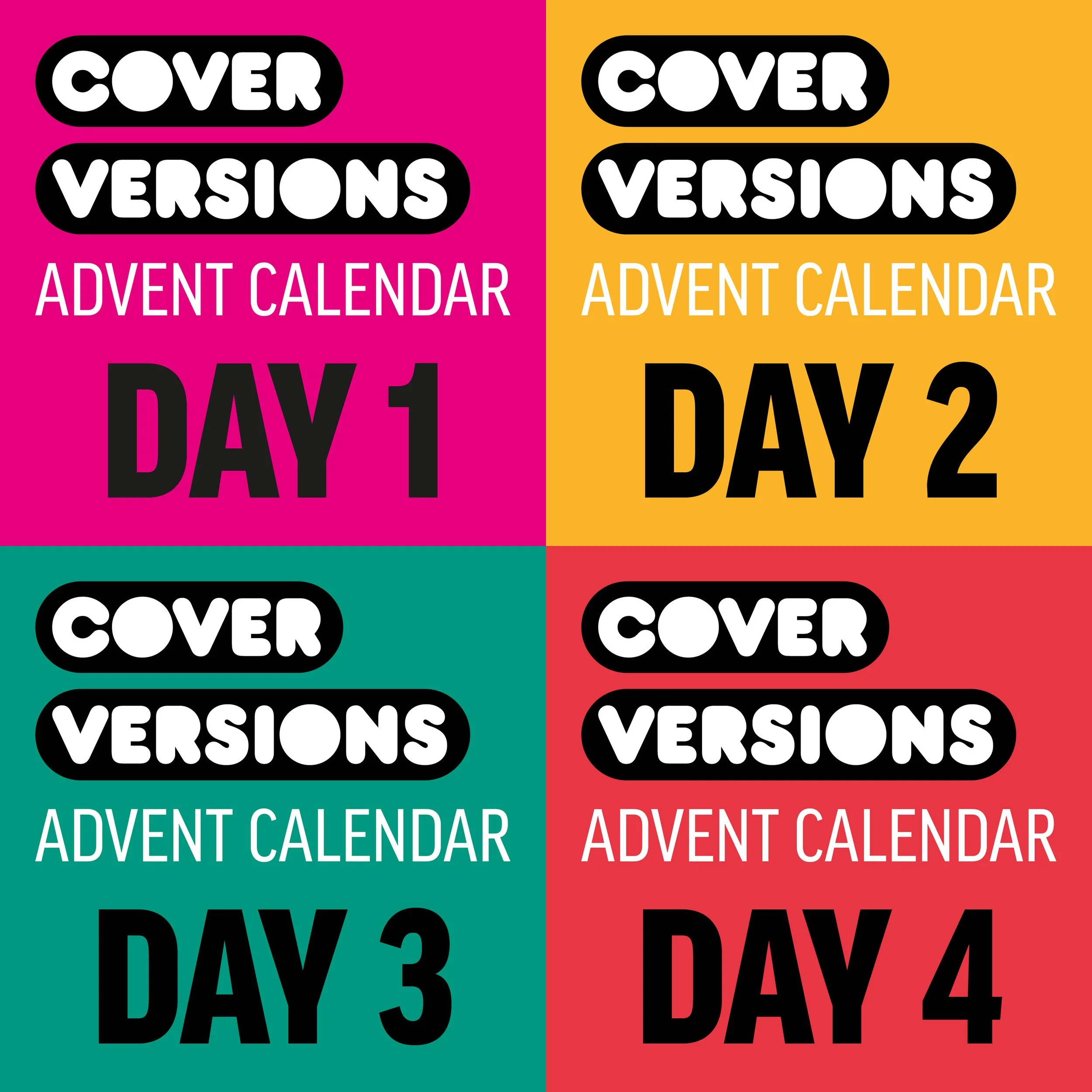
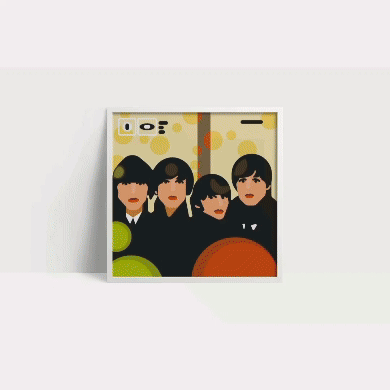
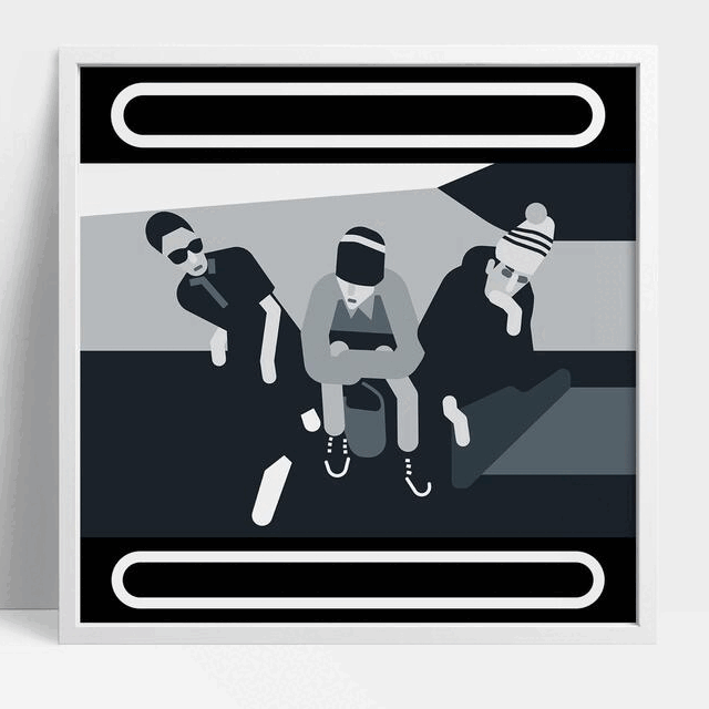
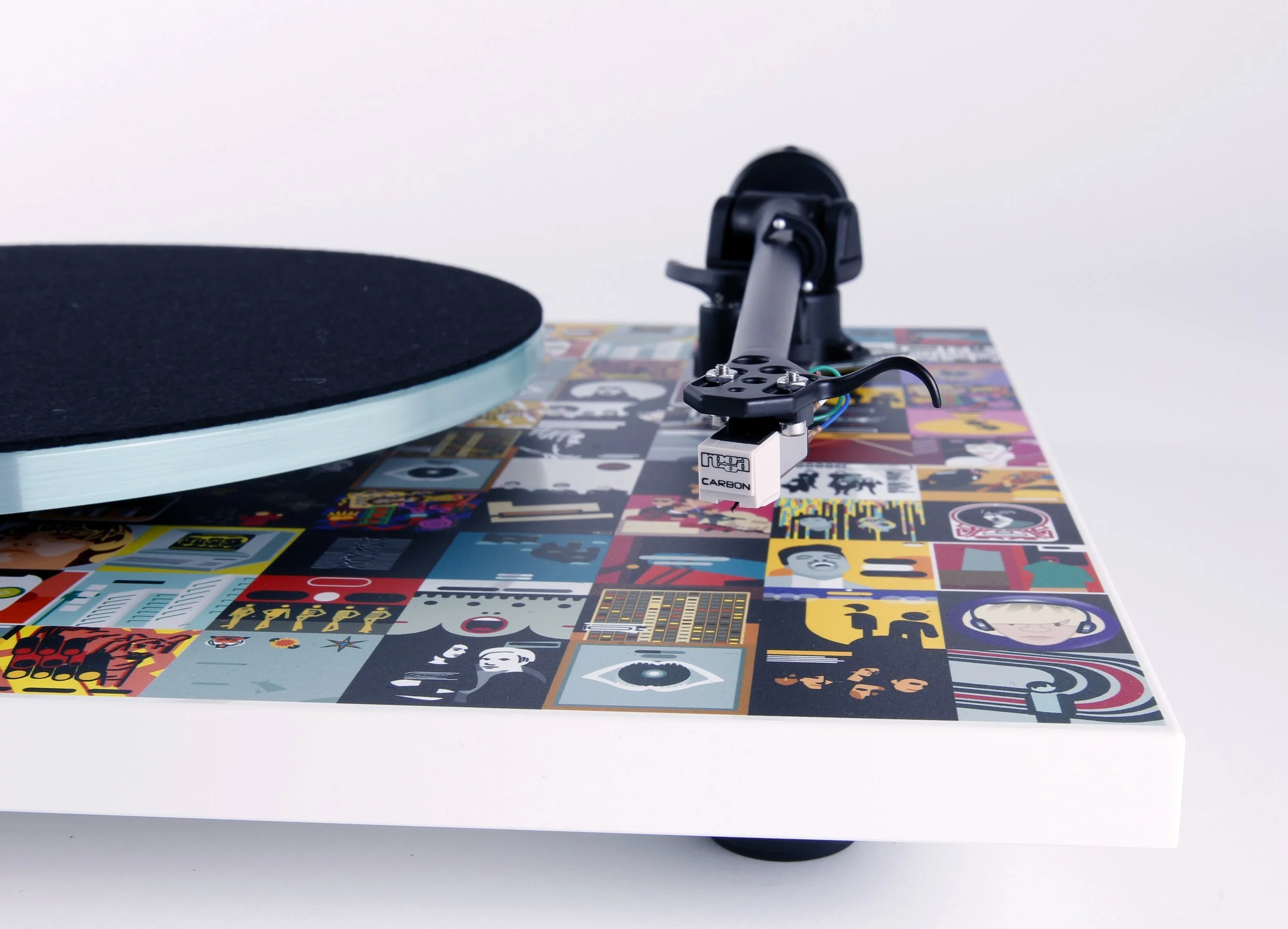
Cover Versions
For the crate diggers and sleeve freaks.
For Cover Versions, we built a brand that works like a label. Every part of it is designed to feel collectible and culturally connected - from the way it looks online to how it shows up at events. The identity rolls out across prints, digital platforms and physical spaces, always carrying the same energy and attitude. It’s music, art and design stitched together into a brand world you want to be part of.
Online
The website functions like both a label catalogue and a record store. Each print drops like a new release, with its own spotlight, but sits within a wider archive that you can dig through just like crates of vinyl. Social media extends that experience, bringing moments from music history into the feed and creating that same sense of discovery.
Events
In physical spaces, Cover Versions comes to life as a pop-up record store. Limited-edition prints, in an immersive setup that invites people to browse, chat and collect. It’s designed to echo the thrill of finding something rare in a record shop, a mix of curation, culture and connection.
Brand World
Cover Versions sits somewhere between a label and a record store, pulling the best of both. It creates a space where music, art and design meet, where every release feels like a collectible moment, and where the culture around it is just as important as the product itself.